Useit Accessibility review






This is the full report of a limited review we made for Nextcloud. See the list of limitations further below. We have given each task the name of which WCAG 2.1 criterium it relates to. This means that under each task there can be several different problems related to the criterion. The tasks have also received a tag explaining in which app the example was found.
The purpose of this review is to get an accessibility statement. Also, to convey the shortcomings we have seen, these could be fixed in future updates.
Review limitation:
In this review, we made some limitations. That’s why we recommend checking through the whole system to ensure accessibility.
-
The review is made with limited test content
-
The system is only tested on desktop
-
Deeper settings or functions are not tested
Examples:
- Profile settings
- Talk app - Video calls, Keyboard shortcuts
- Parts hard to access due to other accessibility problems
-
Limitation of testing software in the system of Försäkringskassan
-
A limited number of apps are tested
- Dashboard
- Filer
- Aktivitet
- Talk
- Deck
- Kalender
- Formulär
- Meddelande
- Only office (supplemented to report)
Critical priority
2.1.1 Keyboard
Problem description
In some parts, there are interactive objects that are impossible to use with keyboard only. This affects keyboard users as it prevents them from interacting with functions.
Examples
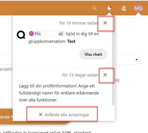
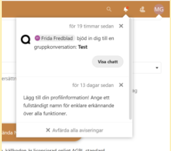
The close buttons in the notification area, shown in the screenshot below, can’t be reached with the keyboard.
Filer app
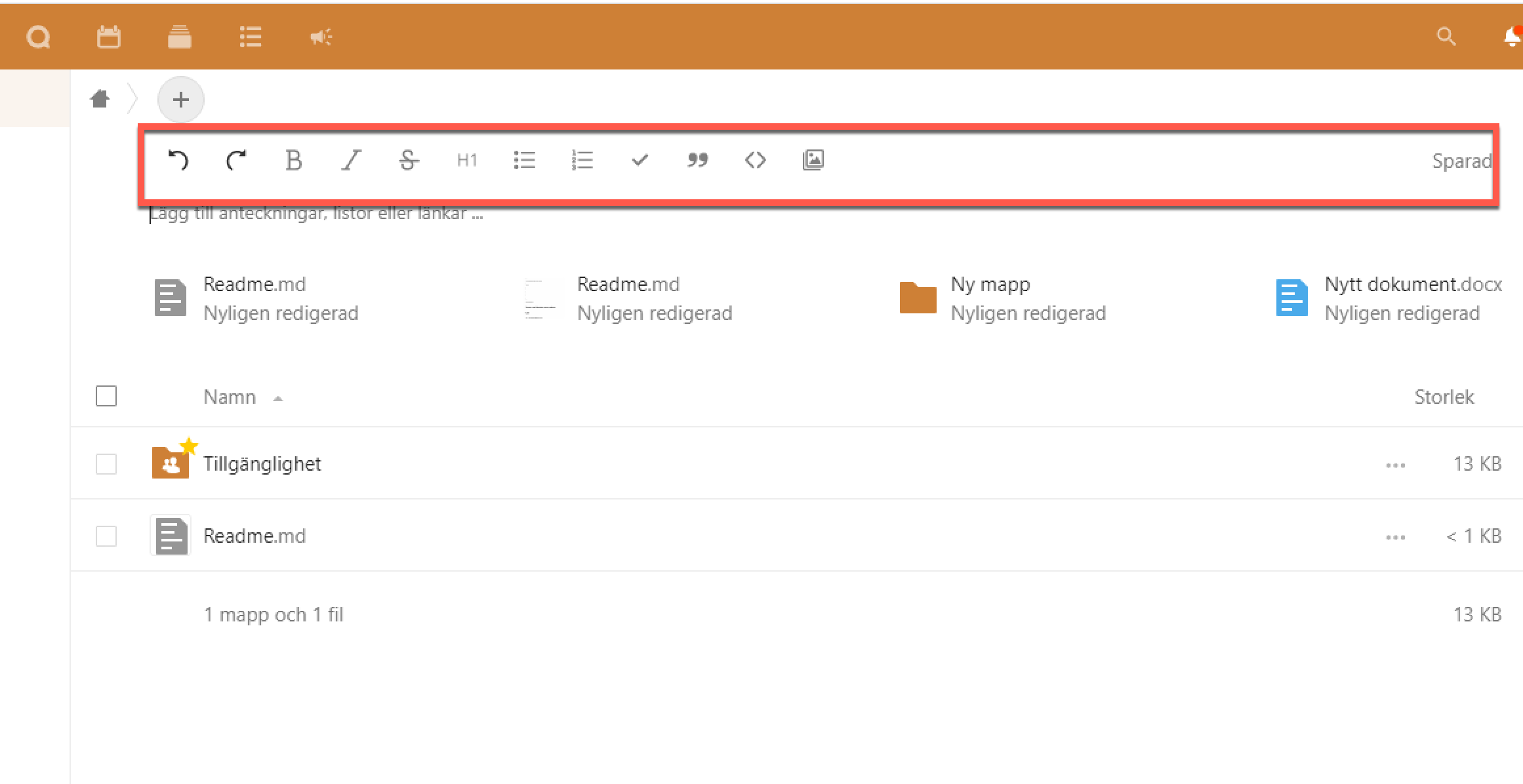
In the Filer app an editing field is integrated into the page content. There’s a list of text formatting tools that only partly be used with the keyboard. These tools are only shown when the user has keyboard or mouse focus in the text field, meaning that if the user navigates to these tools only using the keyboard they disappear.
So, these tools aren’t usable with keyboard navigation.
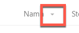
The filtration settings aren’t usable with keyboard navigation. They are possible to reach using a screen reader, but that doesn’t help user who navigate with the keyboard without using a screen reader.
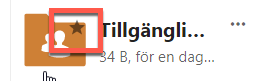
The favorite icon is not reachable with keyboard. Like above it is possible to use with a screen reader.
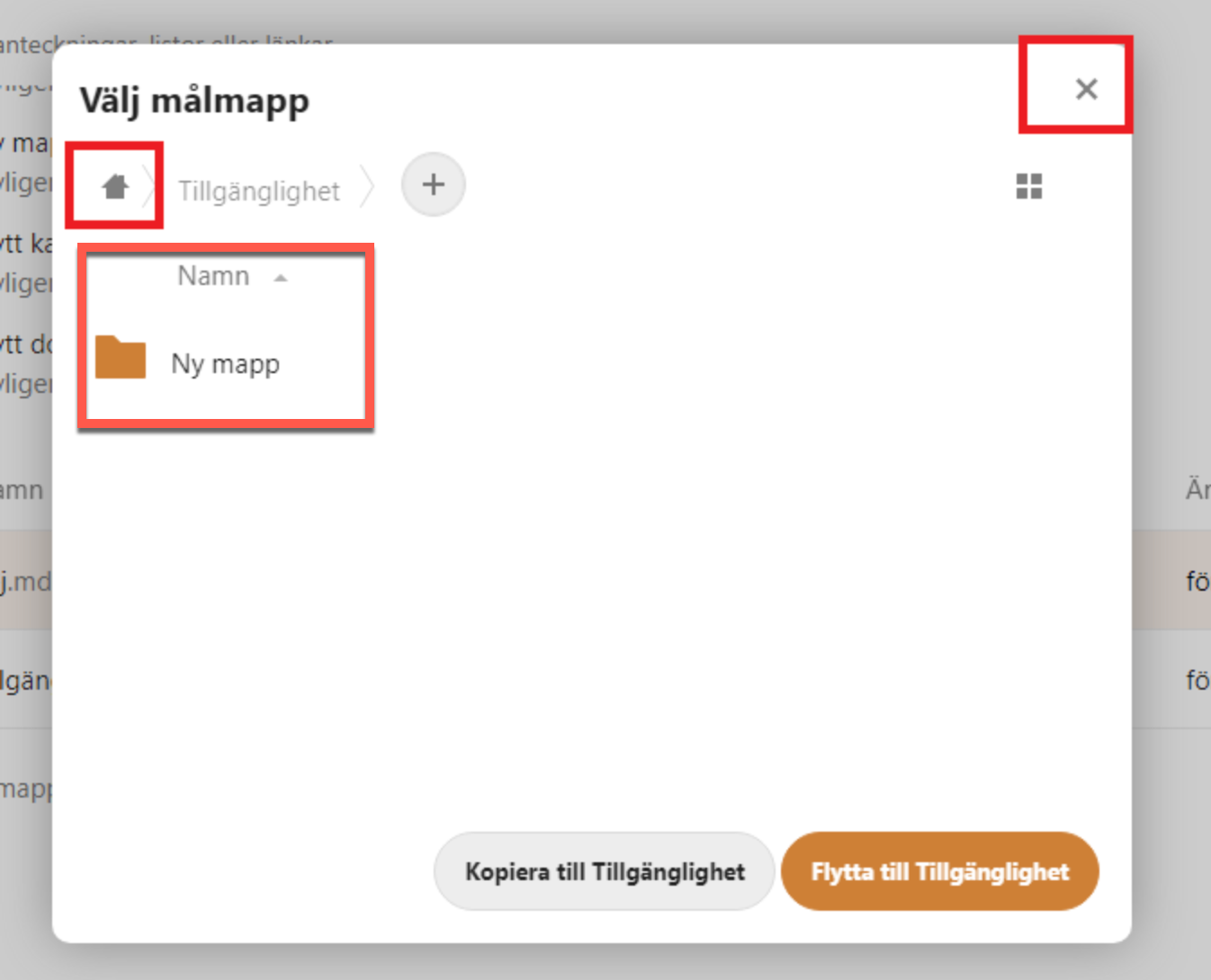
A modal window is used for copying and moving folders. Links in the tree-view on the left, as well as the button for closing the modal, aren’t possible to reach with keyboard navigation.
Kalender app
The following areas aren’t possible to reach with keyboard navigation, even while using a screen reader:
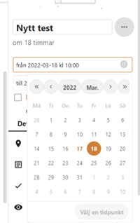
Datepicker
It’s not possible to navigate into the date picker and select a date.
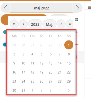
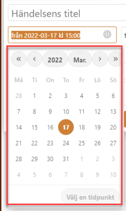
This is true for any place where the date picker is used, for instance when it’s expanded in from the side in the fly-out menu. The calendar area isn’t possible to reach using the keyboard here.
Day view
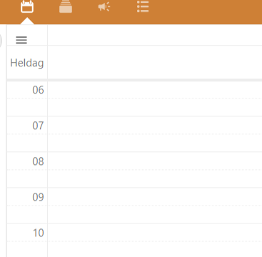
The day view is built using a table, not interactive elements. It’s not possible to navigate into it to add an event using the keyboard.
Week and month views
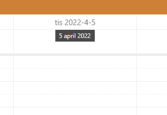
It’s possible to activate the day view from the week and month views using the keyboard, but as mentioned above you can’t do anything in the day view after that.
Day, week and month views
It’s more difficult to add a new event in the day, week and month viewers using the keyboard than it should be.
Mouse users can add a new event directly from each view, but keyboard users can only use the button “New event” in the side menu.
Fly-out
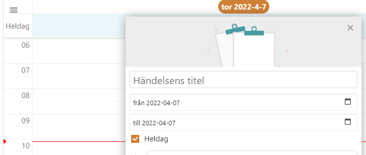
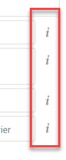
Flyouten: Det finns knappar som inte kan nås med tangentbord. Det är tooltips som ger extra information om inmatningsfälten eller formaten.
In the fly-out that can come out from the side there are information buttons that give extra information about the input fields or formats. But they can’t be reached with the keyboard.
Deck app
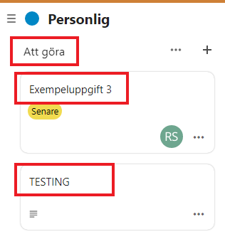
It’s not possible to change the name of lists and cards when using the keyboard. There are no alternative ways of doing so that could be used instead.
When using a screen reader it’s possible to do, the user is told that they can activet the object, but there are not interactive elements here for keyboard users.
This is also true for the detail page for a card, located in the fly-out.
Talk app
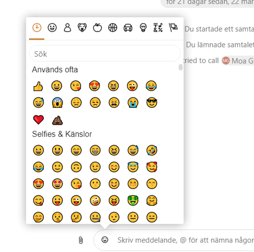
It’s possible to open the emoji menu, but it’s not possible to navigate into it and select an emoji. They’re built using span-elements and aren’t interactive for keyboard users.
It’s possible to navigate to and use the search field, but not to select any of the found emojis.
It works when using a screen reader.
Formulär app
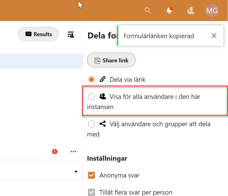
Keyboard users can’t make any changes to an already set up form.
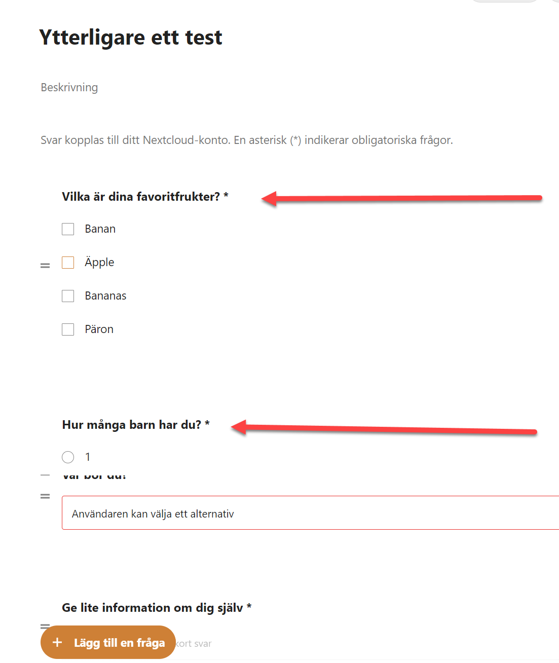
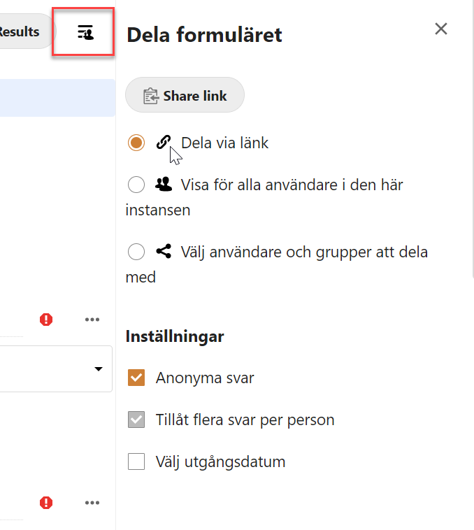
It’s not possible to reach the radio-button “Visa för alla användare i den här instansen” with the keyboard.
Aktiviteter app
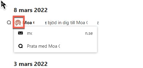
When activating the user icon a menu is opened up underneath it, this menu can’t be reached using the keyboard.
Examples from Meddelande app
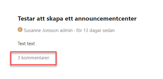
The text showing the number of comments is clickable and opens a menu on the right side. Unfortunately it’s not possible to reach or activate it with the keyboard. It’s not really clear visually that it’s interactive.
This must be possible to use with the keyboard, but making it visually more clear that it’s interactive would benefit all users.
Suggested solution
Why keyboard interaction don’t work depends on different things. In general, we can see that noninteractive element have been used. For example a div-element.
To make keyboard interaction available:
- Use standard html-elements for interactive objects.
- If needed, add tabindex=“0”, proper wai-aria roles and neccessary script to make sure non-native interactive elements work for keyboard and screen reader users. But it’s better to use native interactive elements when possible.
Priority
Critical priority (1)
Affected user groups
- Users with motor impairments
WCAG 2.1 (AA) violations
- 2.1.1 Keyboard (level A)
2.4.3 Focus order
Problem description
To make navigation with the keyboard or a screen reader easy it’s very important that focus moves through the content in a logical order. The most robust way of doing this is usually through the DOM-structure.
General issues
Focus should move from the notification button to the area it opens, move through the interactive elements there, and then move to the next icon to the right of the notification button. But it skips straight to the user button, as shown in the screenshot below.
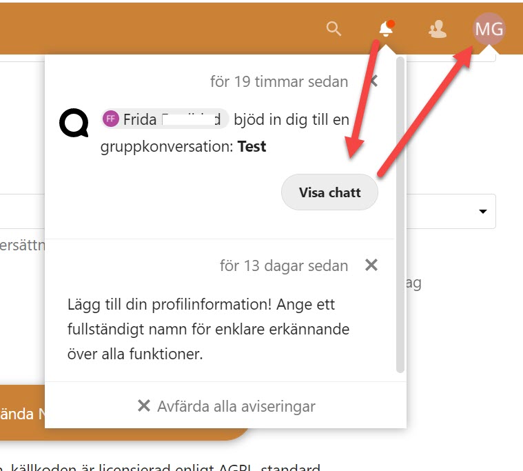
With the notification area closed focus moves in a different order here, though it’s still not correct. As shown in the screenshot below when it comes to the items on the right it starts with the notification button, which isn’t the first one. After that, it moves left to right.
It should start with the search button here, not jump around.
As we were testing these changes were implemented, but there were still issues with the focus order. Make sure focus always moves in a logical and predictable way.

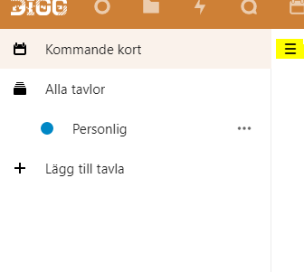
The side menu is open to keyboard navigation, even when it’s closed visually. This makes it harder to use the interface. Make sure that any parts of the interface that are closed aren’t possible to navigate into the keyboard instead of just hiding them visually.
Modals
One issue that can occur here is when a modal is opened but focus isn’t handled properly. In a modal, focus should be set in the modal when it’s opened, and it should stay inside the modal until the user closes it.
However, modals aren’t handled properly here, making it very hard to navigate them with the keyboard, and users with very low vision might not realize that the modal is open at all.
In the examples below focus is not moved to the modal window and the background is still accessible for screen reader users because the background content is not hidden correctly in the code. That means that keyboard users can access interactive content in the background behind the overlay.
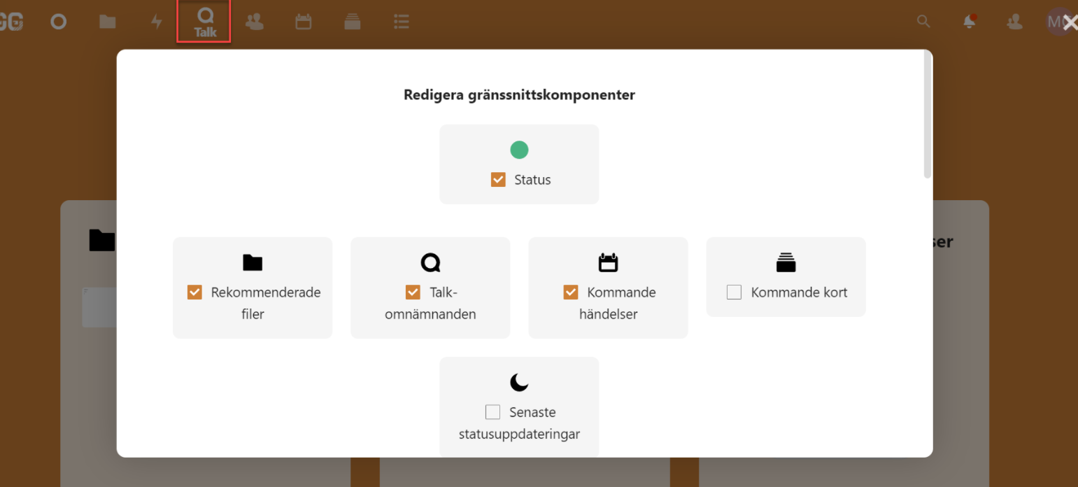
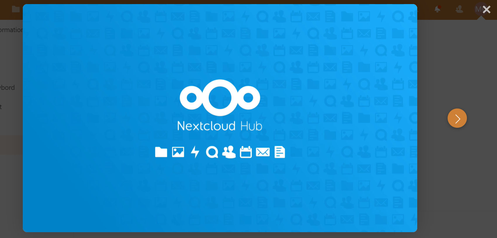
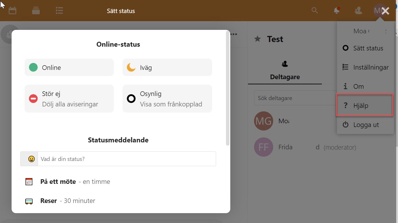
These were three examples of incorrect focus order on modals, but this needs to be improved for all modal windows.
This is a very serious issue for affected users. Modals can be a great way to help the user focus on an important task, but they need to be built correctly or you will lock some users out from using the service.
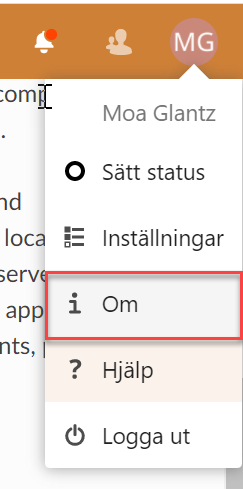
When activating “Om” in the user menu a modal window opens that is not possible to reach with keyboard navigation. When navigating with the tab key focus moves behind the modal, where the user can’t see what happens.
Filer app
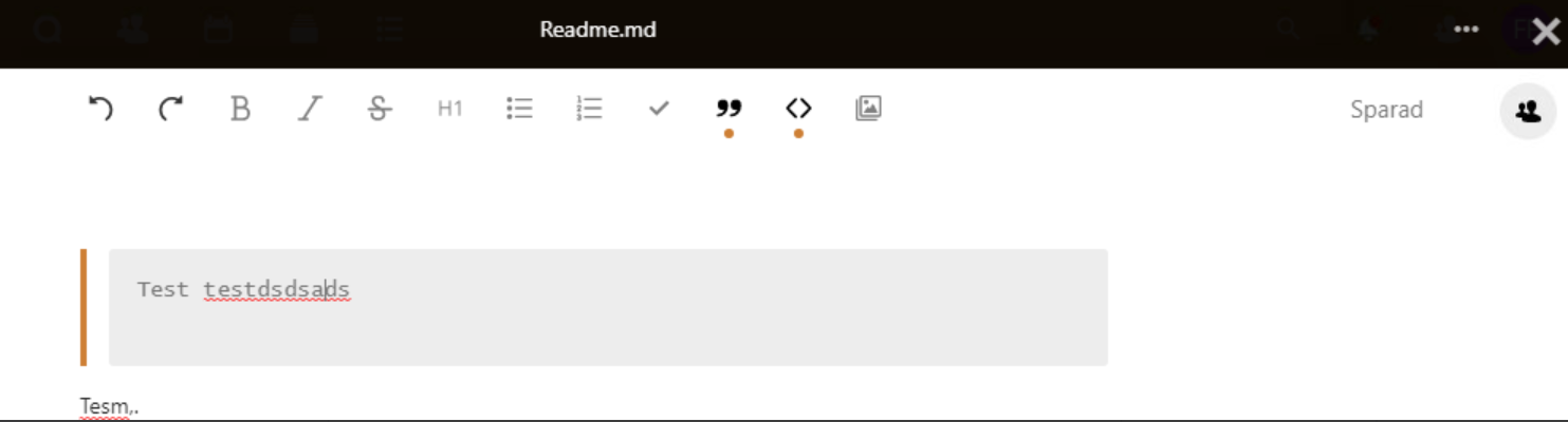
When opening and editing a file a full screen modal opens. But focus remains in the background and the user needs to tab through all the contents in the background without seeing what they’re doing to get to the modal. Most users won’t reach the modal, they’ll assume it’s not possible to reach.
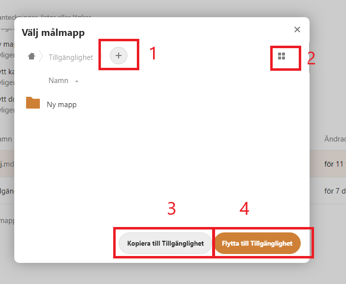
It’s possible to reach the modal for copying and moving folders, but the focus order isn’t logical. Focus begins at the link for adding a folder and skips some interactive elements. It’s also possible to navigate outside of the modal, which shouldn’t be possible.
Deck app
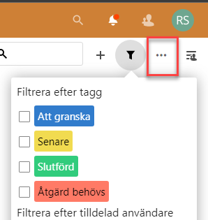
When the menu that is shown in the screenshot below is open the focus order should move from the button that opened it, into the menu, and then once it’s gone through all the interactive elements there it should move to the next button in the top menu.
Unfortunately, the focus does not move into the open menu at all, instead of moving to the next button in the top menu.
This open menu is placed incorrectly in the DOM-structure, making it very hard to reach for users who navigate with the keyboard, but especially for users who can’t see that the menu is open.
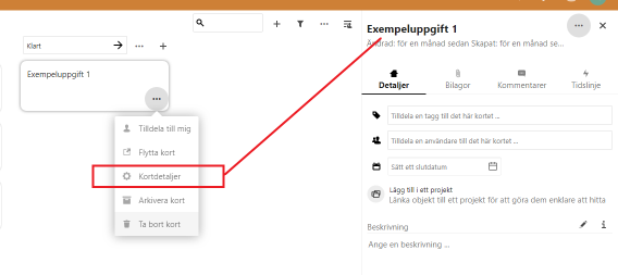
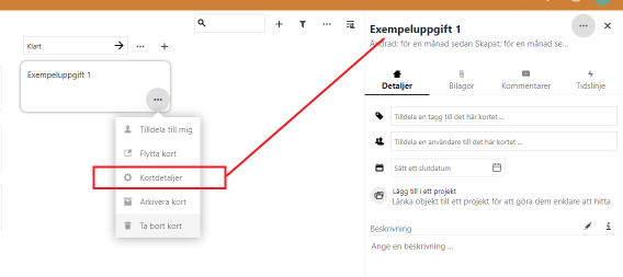
When the user activates the button “Åtgärder” on a card, and then chooses “Kortdetaljer” a menu opens up on the right side of the viewport. But screen reader users are not informed of this, so they have no way of knowing that a new area has been opened.
When this area opens, move focus to it. That will make it possible to use for screen reader users, while also making it easier for all those who navigate with the keyboard.
Kalender app
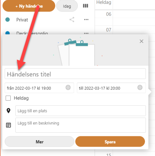
In desktop mode “Ny händelse” is opened as a modal window. Focus is placed in the windows as it should, but in other places, similar functions aren’t handled correctly.
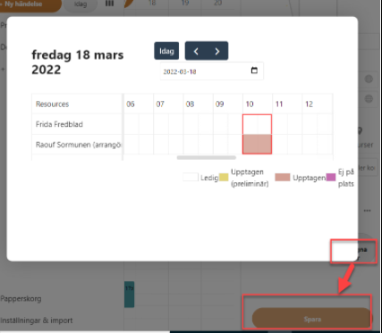
When booking a time for a meeting with a colleague there’s a function for checking availability which opens a modal window. Focus is not moved into the modal but to the “Spara” button.
Formulär app
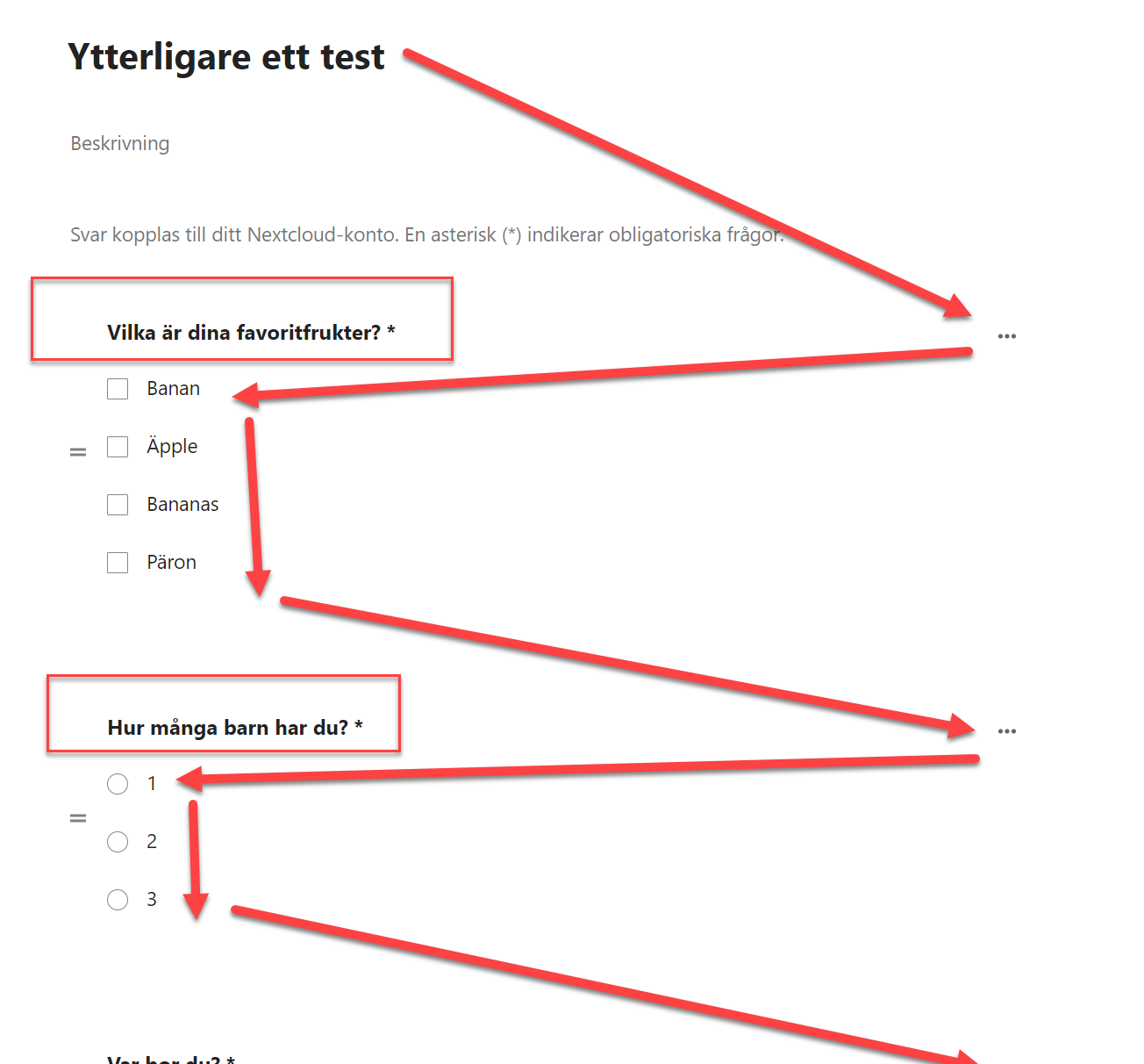
When adding checkboxes to a form there’s an issue with focus order. When we opened the options for the question focus moved through the options as expected, but after that, it jumped to higher up on the page.
When finished moving through an opened area such as this focus should move to the next interactive object after the one that opened the area. It should not jump to a completely different part of the page.
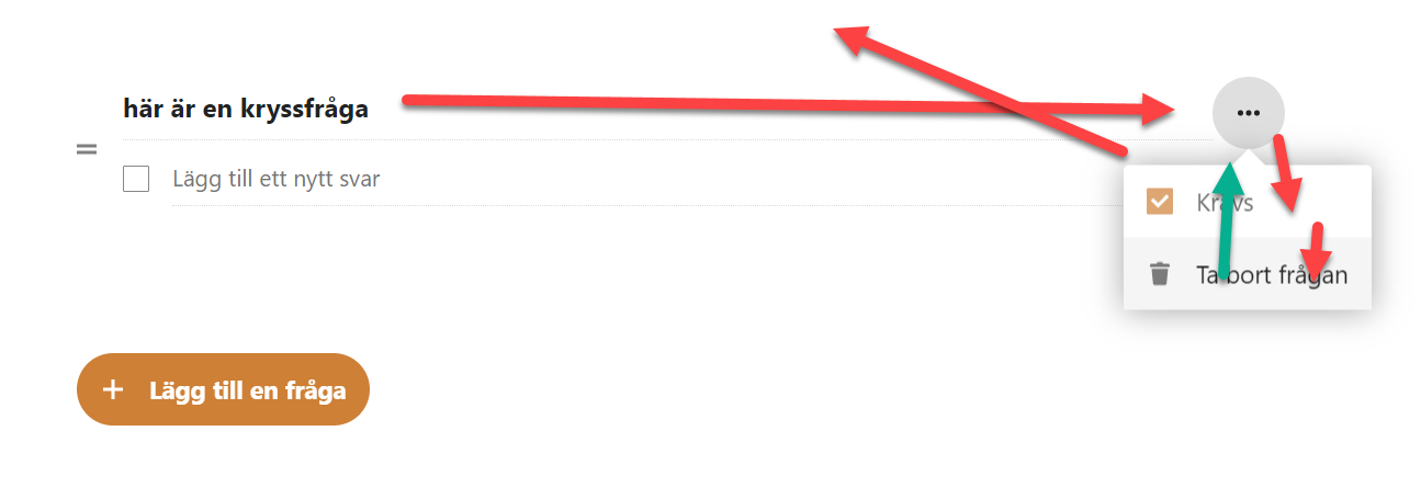
The headings in the form are interactive but aren’t possible to use with the keyboard. When you make them interactive for keyboard users, take care that they’re placed logically in the focus order.
When opening the fly-out in the form focus isn’t moved into the new area, but back to the main content.
Suggested solution
Best practice when opening a modal:
- Place focus in the modal window
- Implement a keyboard focus loop while the modal is open, so that the user cannot tab to elements outside of the area
- Hide all background content from screen readers with
aria-hiddenwhile the modal is open - Test to make sure it works as it should
- For more information, refer to the WAI-ARIA 1.2 Authoring practices pattern for dialogs
Priority
Critical priority (1)
Affected user groups
- Blind and visually impaired users with screen readers
- Users with motor impairments
WCAG 2.1 (AA) violations
- 2.4.3 Focus Order (level A)
4.1.2 Name, Role, Value
Problem description
All interactive elements must have an accessible name, and a text value that explains their function to assistive technology. They should also communicate their status, so if an area can be either expanded or collapsed the button that controls the area must communicate the current state.
Several buttons are missing names or do not communicate any change of status when needed.
In some places, objects have an accessible name in English, even though the rest of the interface is in Swedish. It’s important that such visually hidden texts match the language of the rest of the interface.
We will go through some categories of different issues below, then we’ll go into problems in specific apps.
Examples of buttons controlling expandable areas
In these examples screen reader users get incorrect information about the status of the area. screen reader user needs to get information if the area is expanded or not. To solve this you can use aria-expanded on expandable objects.
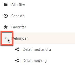
In the screenshot below the object “Delningar” opens and closes an area, this is shown with the arrow icon that is marked in the screenshot below. But it doesn’t use the aria-expanded attribute and screen reader users aren’t told of this function, or if the area is open or not.
The same thing is true for the notification button shown in the screenshot below. It needs to use aria-expanded to communicate its function.
Name in the wrong language
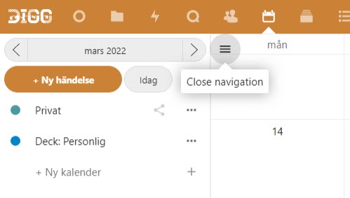
The button to open or close the side menu is named in English, but the rest of the interface is in Swedish. Make sure that the names of all objects match the language shown in the interface.
This issue is quite common and will require systematic effort to address.
Interactive objects without an accessible name or unclear name
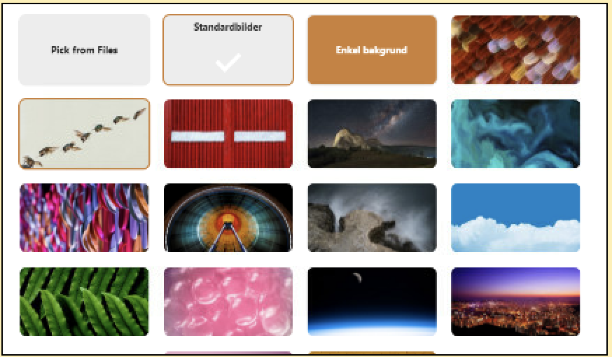
At the start settings to change background, there are interactive images that are missing accessible names. They need to have descriptions so assistive technology can communicate to the user what function they serve, and what option each image represents.
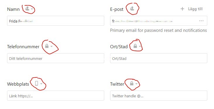
In the profile settings, the privacy level status of the different elements isn’t explained to screen reader users.
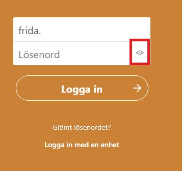
In the login form, there’s a button for showing or hiding the password. This button does not have a name and does not communicate to the user its status if the password is hidden or not. This is a security risk as a user who can’t see the interface could unknowingly expose their password to people around them.
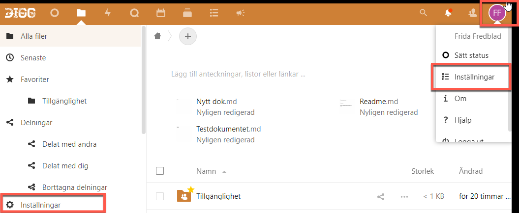
Three interactive objects are marked in the screenshot below. They all have the same accessible name, “Inställningar” (“Settings”), but they control different functions.
For example, the button with the initials in the top right and the “Inställningar”-object in the menu it opens has the same name.
This makes it hard for users relying on screen readers and similar assistive technologies to understand the difference. It would be best to include what settings it concerns in the name as well, though always begin the name with any written text on the page. So for example “Settings Files” could work.
This technically fulfils this WCAG-criterion, but in practice this is a problem.
Always make sure that an object’s accessible name identifies it and makes it easy to understand its function, and when necessary differentiates it from other, similar, objects.
Filer app
The button to add a folder as a favorite is missing an accessible name.
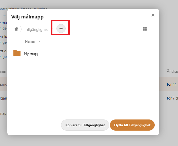
In the modal for copying or moving a file, there are several issues. To take just one the link for adding a folder does not have a name. In our testing, our screen reader read the link goal, which was very hard to understand.
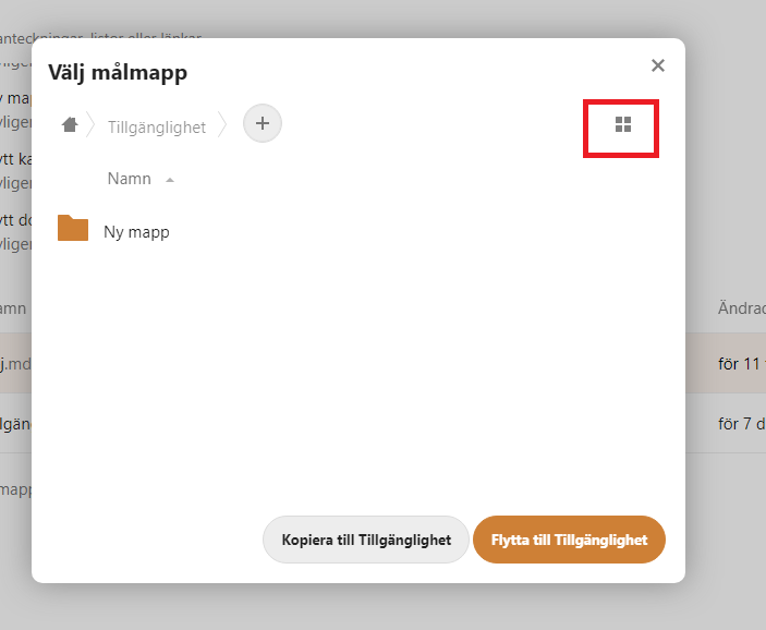
The same is true for the checkbox for activating the grid layout in the modal for copying or moving folders. This checkbox does not have an accessible name meaning that screen reader users have to guess what it does. The only information a screen reader can find is if the checkbox has is checked or not, but nothing on what that means.
The checkbox is designed to look like a button, it’s marked in the screenshot below.
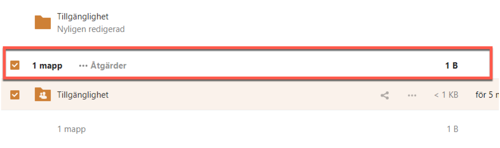
The checkbox for selecting all the folders or files has the accessible name “Välj” (“Select”). This doesn’t explain that it will select all the folders or files. It’s name must be improved to more clearly explain it’s function.
The same problem is present for checkboxes for selecting a singe document or folder in the lists.
In the screenshot below the label says “Väj” (“Select”), but it doesn’t explain which folder or document the user is selecting. Use labels to describe the function of these checkboxes more clearly.

To change between a grid and a list the user activates a checkbox. Screen reader will read “Växla rutnätsvy” (“change gridview”) and whether it’s checked or not checked, but gives no information on if a grid or list is currently selected.
To make this usable for screen reader users make it clear what will happen if they activate it. “Change to grid layout”, “Change to list layout”.
This will need to be looked at and addressed with any function that changes the view in a similar way.
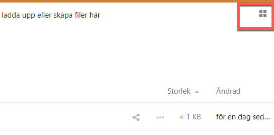
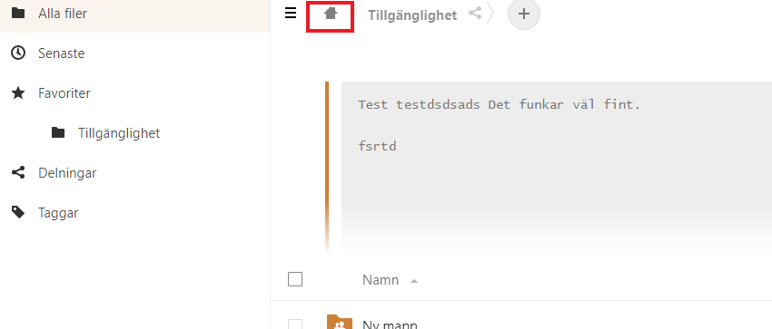
The home-button showing a house icon used to navigate back to the treeview has the English text “home”. This should be in Swedish, since the interface is in Swedish, but even if translated we believe this text can make the user believe it will lead to the start page for the whole service. Naming it something like “Hem Filer” can make it clearer that it will lead to the start page of the current app.
Talk app
There are many examples here of buttons missing names.
View and chat buttons in live conversations are missing accessible names.

The record button in chat input is missing an accessible name.

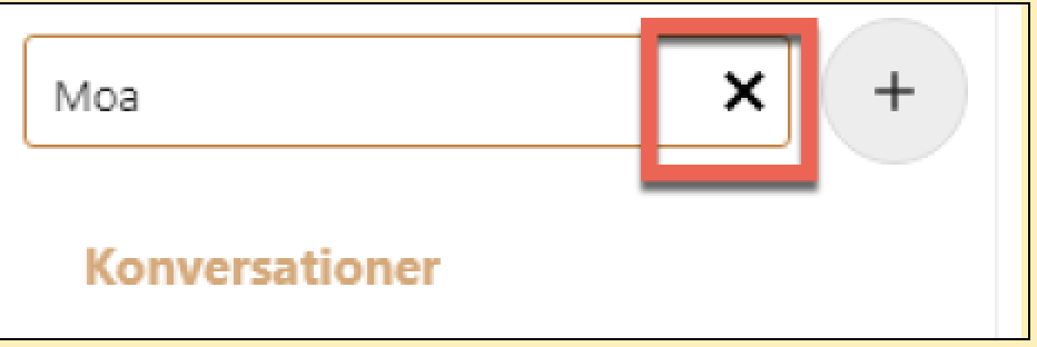
The button for removing the text from the text field is missing a name.
Kalender app
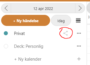
The share button marked in the screenshot below does not have an accessible name. There is an aria-label that should work as an accessible name, but it has been hidden with the aria-hidden attribute.
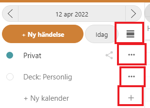
The buttons marked in the screenshot below all have different functions, but they have the same accessible name “Åtgärder”. This makes it impossible for screen reader users to know which button does what. There are generally quite a lot of issues with different elements using the same accessible name.
Since they have names this technically fulfils 4.1.2, but this really isn’t usable for screen reader users.
Make sure the names of all interactive elements clearly explain their function. Don’t use identical accessible names for objects with different functionality.
We’re also a bit perplexed why there are two buttons with tripple-dots here. Visually it’s hard to understand the difference.
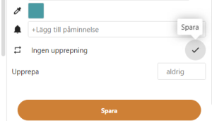
In the fly-ut menu for an event, there is a button with a pen-icon. This does not have an accessible name but uses the aria-describedby attribute for the description “Redigera” (“Edit”). This attribute is great for giving additional information for an element, but it does not count towards an accessible name.
You should use actual text here, or the aria-label attribute. Visual text in combination with an icon is the most robust way to communicate a button’s function to the user.
When the user activates the button it changes to a button to save the changes, and the aria-describedby changes to “Spara” (“Save”). Apart from this still not being an accessible name there is already a button named “Spara” very close by. Make sure to name this button in a way that differentiates it so it’s easy to understand exactly what it saves.
The button to change the color also doesn’t have an accessible name.
Deck app
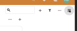
The button with the light grey marking in the screenshot below does not have an accessible name.
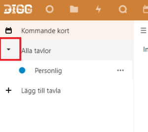
The button to expand “Alla tavlor” is missing a name. It also doesn’t use aria-expanded, so screen reader users will not be notified of its functionality.
Meddelande app
The element that opens the right side menu has the wrong role, as it is a non-semantic div-element instead of a button or link. See 2.1.1 and 4.1.3 as well.
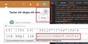
The button marked in the screenshot has got the name “announcementcenter”. This is not the most user-friendly name, but there are also issues with how it communicates that it opens and closes an area. From what we can see it uses its title-attribute to communicate that it can open or close an area. This is not very robust, some assistive technologies don’t use this attribute. Use the aria-expanded attribute to communicate its status instead.
We also recommend that you make this link into a button, set aria-hidden in the svg-element, and use a Swedish text for the name.
Formulär app
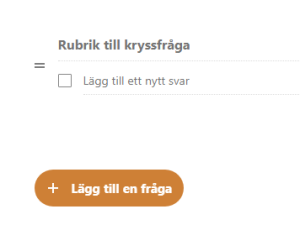
The button for adding en new question to the form has the wrong role and name. Visually there is the text “Lägg till fråga”, which would be correct. But it has been overridden by an aria-label attribute set to “åtgärder”, which is completely wrong and misleading. So screen reader users hear this erroneous description instead of the actual one.
The button is placed inside of a div-element that has been given the role of the toolbar. This is not appropriate in this situation and gives screen reader users misleading information. The button has aria-popup which informs screen reader users of its function, so remove the toolbar role from the div.
Suggested solution
- Use aria-expanded to communicate the status for expandable objects
- Make sure all interactive elements have the correct name for their functions. And in the correct language
- Make sure all elements have their role set correctly, preferably by using correct semantic html
Priority
Critical priority (1)
Affected user groups
- Blind and visually impaired users with screen readers
WCAG 2.1 (AA) violations
- 4.1.2 Name, Role, Value (level A)
OnlyOffice (Complementary Review)
Problem description
Summary
We have seen that there are major accessibility issues within this part of the interface. In the review, we have selected some overall criterium that we see are important to enable a deeper review of OnlyOffice.
The interface is highly focused on mouse interaction. Keyboard only users are able to start a word document, an excel spreadsheet, or a presentation but face real difficulties closing the applications. In effect a keyboard trap. The different applications are placed over the web interface and work as a modal window, but the keyboard focus doesn’t automatically move to the new interface. The interface can be used by keyboard-only users using shortcuts, but shortcuts are only presented visually on the screen, in effect not usable for screen reader users. The visual focus marker/indicator is not present so keyboard-only users are not able to see where they are in the different apps, except for the editing area. The editing area isn’t possible to use as a screen reader user since the content entered isn’t conveyed to speech or braille output. Buttons calling for action are button objects, but without a button name/value unless button text is displayed visually.
So, there’s a major challenge to making the OnlyOffice interface accessible. If it’s the Microsoft implementation, alternatives should be considered.
Even if this is outside the scope of this review you need to consider following Authoring Tool Accessibility Guidelines, ATAG 2.0, for the OnlyOffice implementation. The OnlyOffice interface resembles the desktop implementation of Microsoft Office. This implementation however needs to be accessible and produce accessible content.
1.1.1 Non-text content
Meaningful images/icon buttons are missing alternative texts. A name on the button will probably solve the issue of meaningful images as well, see 4.1.2.
2.1.1 Keyboard
The entire interface is not easy to navigate using only a keyboard.
A prerequisite is a visual focus indicator, see 2.4.7, but also that the user understands when the focus is in the editable area. In Excel, the user gets a default starting point in cell A1, but the user can not reach buttons or menus outside the spreadsheet.
In Word and PowerPoint the user reaches the Office interface after navigating through the web interface. After navigating through all office interface objects, the user reaches the editor. Screen reader users are given more information in the interface, but no feedback on what is typed in the text editor in word or PowerPoint.
To navigate the menus short cuts are used, and as a web interface, a comprehensive list is needed with all of the keyboard commands.
2.1.2 No Keyboard Trap
While the users are able to start the office programs by creating a document, spreadsheet, or presentation, but lack the opportunity to close the programs with the keyboards, it is considered a keyboard trap. How are users supposed to return to the web interface?
Theoretically, it’s possible to close Excel, Word, PowerPoint, and Forms with “Gå till document” in the “Arkiv” menu, which closes the embedded office application. It’s possible to close the office by moving the cursor to the browser address field (with a keyboard shortcut) and choosing the “Filer” app again. This is particularly cumbersome for keyboard-only users and screen reader users.
2.4.7 Focus Visible
There’s no visual indication of buttons, menus, or controllers in documents and presentations. Spreadsheets only have a built-in indicator in the editable area. Documents and presentations only have a blinking cursor in the editor area.
4.1.2 Name, Role, Value
The office interfaces consist of icon buttons, some with visible text. The text is presented to screen reader users. Without text, the buttons are not accessible. All buttons have the role of button or link. Without text buttons are displayed as “button”, “clickable” or “clickable button”.
The office apps are placed in an iframe without the title attribute. The title tells screen reader users the nature of the content inside the frame, giving them an option to skip the frame or not.
Suggested solution
Priority
Critical priority (1)
Affected user groups
- Blind and visually impaired users with screen readers
- Users with motor impairments
- Low-vision users
WCAG 2.1 (AA) violations
- 1.1.1 Non-text Content (level A)
- 2.1.1 Keyboard (level A)
- 2.1.3 Keyboard (No Exception) (level AAA)
- 2.4.7 Focus Visible (level AA)
- 4.1.2 Name, Role, Value (level A)
High priority
1.1.1 Non-text content
Problem description
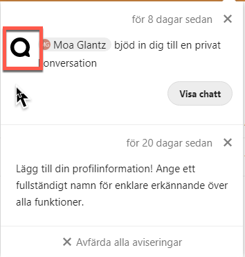
There are graphics without alternative texts in several places. In the example below the icon is there to show which kind of notification it is, this should be conveyed in its alternative text.
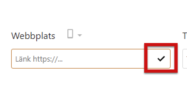
A check mark is used to show when personal data has been verified on the page for profile settings. This check mark is a graphical object without an alternative text.
Filer app
The icon to show that a file is locked does not have a description. In addition to giving it an alternative text communicating it’s purpose, this should also be conveyed to screen reader users when they reach the file in question, see 1.3.1 in this report.

Deck app
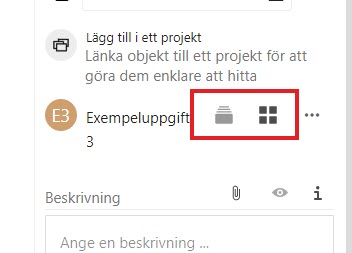
In the fly-out in the right side menu, there are images without alt-attributes, which must be present for such elements. They are placed in links without link texts, which means that screen reader users don’t get any information on their purpose.
There seems to be a dynamic reading of a text through aria-describeby, but it disappears.
You can use the alternative texts for the images to give these links understandable link texts. Or you can give them alt="" and place texts in the links for much the same effect.
Suggested solution
- Give alternative texts to graphical objects by using the alt-attribute
- If the graphical objects is purely decorative and not needed to understand interface give it an empty alt-attribute, alt=""
- If a link has an image in it the text in the alt-attribute works as a link text
Priority
High priority (2)
Affected user groups
- Blind and visually impaired users with screen readers
WCAG 2.1 (AA) violations
- 1.1.1 Non-text Content (level A)
1.3.1 Info and relationships
Problem description
Heading structure
Using a correct heading structure facilitates navigation for screen reader users. It helps those users to understand the structure of the page content.
Headings should present the information structure to the user in an easy-to-understand way. To do that all headings must be marked up as such, their heading levels in the code should match the logical level they serve in the information structure, and the headings must never skip a level.
When it comes to this type of system, there may be some challenges in following a correct heading structure, due to the different functionalities and structures of the pages. But it is important to find practical solutions here.
We can see that to some extent hidden headings have been used to support screen reader users. This can be a good way of solving pages where it would be difficult to use visual headings. But in most places, many users can benefit from visible headings so this solution should be used with caution.
Unfortunately, there are issues with the headings on several pages:
- Headings aren’t structured correctly to match the information structure
- In some places, headings skip levels
- Some headings aren’t marked up as such in the code
- Some content that aren’t headings are coded using heading-elements
This all makes the content structure very hard to understand for screen reader users.
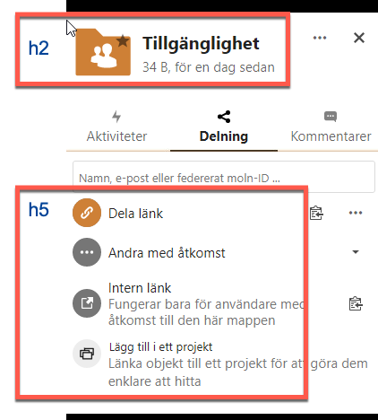
In the image below the functions under the input field are coded as h5 but visually they aren’t headings but buttons. If the content doesn’t function as headings, don’t code them as such.
Heading elements or aria-headings
Headings are sometimes built using h-elements, but sometimes they’re made using WAI-ARIA instead. We recommend that you use h-elements wherever possible. It’s a more robust solution and the best way to make it compatible with as many assistive technologies as possible.
Deck app
There are some examples of issues with the heading structure in the Deck app as well.
The headings don’t skip levels here, but they don’t match the logical structure of the content. To take an example the heading “Kommande kort” isn’t related to the different lists on the overview page, “Today”, “Tomorrow” and such. In the middle of this list, there is also a hidden heading saying “Denna tavla är skrivskyddad” (“This board is read only”) which doesn’t make any sense as a heading.
In “Egna tavlor” the heading structure is even more illogical. “Börja skriva för att söka” is a heading by the search function, which isn’t needed and can be confusing for users, there’s a visually hidden heading “Släpp dina filer för att ladda upp” that is above all the cards in the structure. These texts are instructions, they should not be coded as headings.
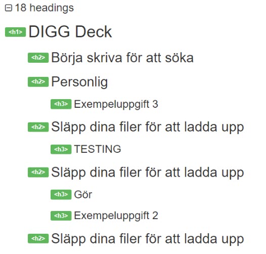
When the flyout is open there is a problem with skipped heading levels, as it goes directly from a heading level 3 to one at level 5.
Drop-down
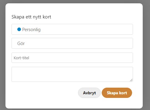
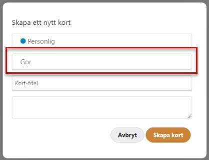
There are hybrid objects in the modal window for creating a new card, they’re select fields that the user can also type in.
Unfortunately, they don’t work well with screen readers. When pressing the down arrow to move down to the select options the focus moves visually, but the screen reader only reads any text written in the field or “Empty” if the field is indeed empty.
This needs to be changed so it works with screen readers and thoroughly tested.
Label not connected to form-element
A label and the form-element it identifies must be connected in the code. That way users with assistive technology such as screen readers can easily understand the purpose of the form-element.
Unfortunately, we saw several places where labels and their form-elements aren’t connected, making them challenging to use for screen reader users.
Filer app
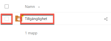
Here the checkbox does not give information on which folder it controls. If there were several folders here it would be very hard to understand which checkbox belongs to which folder. An aria-label on the checkbox stating it’s function and which folder it belongs to would solve the issue.
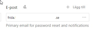
In profile settings, the E-mail label and input fields aren’t connected in the code. Using the for-attribute on the label-element to connect it to the input field is the standard way of doing this.
You also need to make sure that the message under the input field is read by screen readers in association with the field. One way of doing this is to use aria-describedby on the input field and reference the id of the text under the field.
Formulär app
The same thing is true here as well, using the for-attribute will solve it.

Messages app
There’s a menu that can pop in from the side, and the form fields there aren’t connected to their label texts.
Table structure
In the Files app there are tables that aren’t coded correctly. Tables need to have a connection between table headings and data cells. Using table headings for all relevant headings, and using scope set to col or row will make tables understandable to those using screen readers.
Remember, when you use interactive elements in tables you also must consider accessible names for the interactive elements.
File locked or not
When a visual indicator is important for the users interaction with an object, there should be a text explanation at the object to relay this information to the user.
In the File app a lock-icon shows when a file is locked and can’t be opened. But if the user can’t see the icon they won’t understand why they can’t open the file. Make sure to add the locked status to the accessible name of the interactive element. So in the example below, we could use aria-describedby connected to the id of the lock icon to connect it to the file name.
Unfortunately, the lock icon doesn’t have an alternative text, so it wouldn’t be read anyway, but more on that in 1.1.1.

Chat - message info
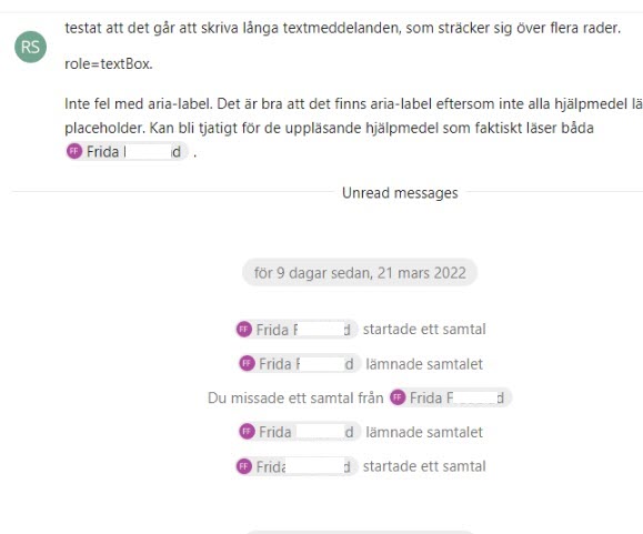
When using the chat with a screen reader it’s very hard to understand which name and timestamp belong to each message. These must be connected so the user easily can understand which name and timestamp correspond to which message.
It would be worth looking into how to do this the best way, but using aria-describedby on the message to connect it to the name and timestamp would be one way to do it. User testing would be beneficial here to make sure the connection is understandable.
Buttons do not explain context
Many buttons in the interface have very generic accessible names. This makes it very hard to understand the difference between similar buttons, and what parts of the interface they’re connected to in the context.
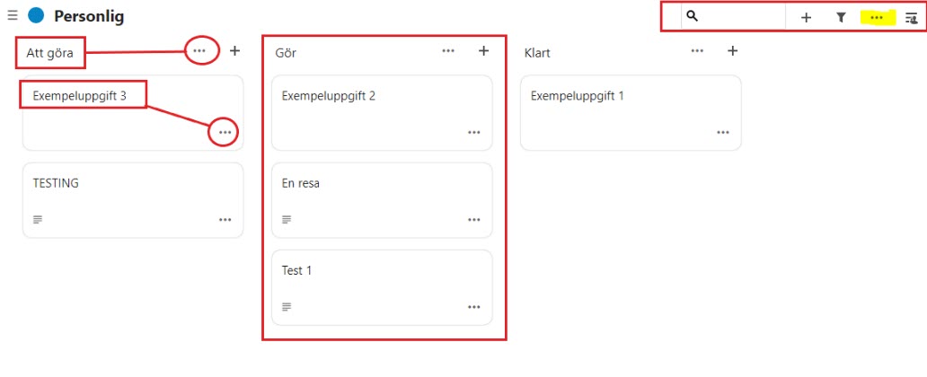
Take the screenshot below from the Deck app. All the “…"-buttons have the same accessible name, this makes it nearly impossible for screen reader users to guess their function in the interface.
Make sure all accessible names explain the function of interactive elements clearly, including any context necessary to understand.
Fieldset and legend
Fieldset and legend can be used to programmatically connect a heading to a group of form objects. This is a good way to group form objects together in logical groups, like delivery address and invoice address.
We’ve seen a few places where fieldset and legend need to be implemented to make the function of form objects easily understandable to screen reader users.
Kalender app
The fields and dropdowns in the fly-out for “Ny händelse” could be organized using fieldset and legend. This is for the form itself, not the tabs.
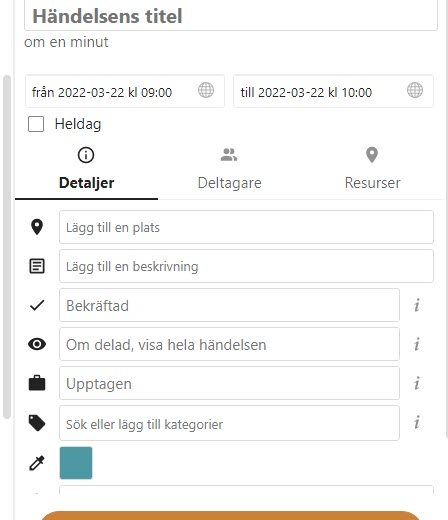
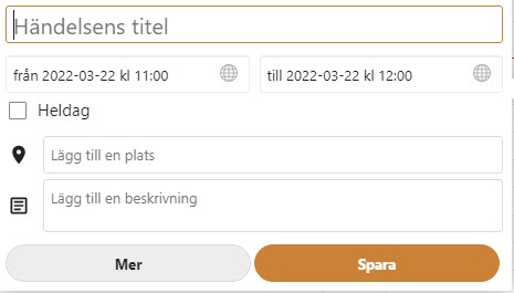
In the modal window for adding events there is also a form that should be grouped.
Deck app
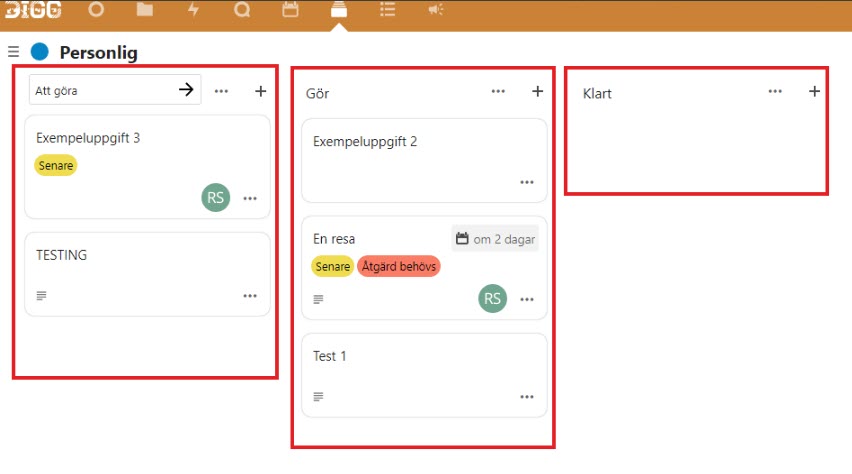
Another example can be found in the Deck app. Here the fields are divided into three columns. Using fieldsets around these, with visible headings in legend-elements will connect each form object in each fieldset to its legend-attribute, making this interface a lot easier to understand and use for screen reader users.
Layout table
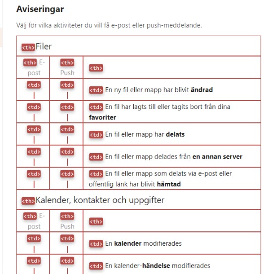
When selecting options for notifications in the app Activities the layout uses a table. The WCAG-standard does not forbid using tables for layout, though it strongly recommends using CSS for layout instead.
If you want to use a table here, you should avoid using any semantic table elements, such as th-elements, though td-elements are ok, since assistive technology doesn’t rely on differentiating them from standard text-elements.
But we recommend that you use CSS for the layout here instead.
Drop-downs and screen readers
In the Deck app there are some form fields that work as hybrid input fields and select-elements. When the user activates it a selection of choices is shown, but the user can also write their own text in the field.
Unfortunately, the select functionality here does not work with screen readers. The screen reader will only read what’s written in the field, but won’t read the options in the select-options. When the user presses down arrow the focus marker moves down into the options, but they’re not read by the screen reader, instead, it just says what the user has written in the field or “Empty” if the field is empty, likely the screen reader focus does not move down with the keyboard focus.
If a hybrid field should be used here it must be done in an accessible way and work well for both keyboard navigation and screen reader users.
In the screenshot below the marked field is a hybrid field, we wrote “Gör” in it.
Login page
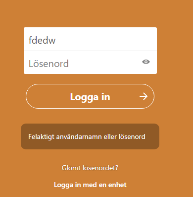
An error message can be shown but it’s not connected in the code to the fields it concerns. Making separate error messages for username and password would make this easier to implement and easier for users to understand.
Suggested solution
- Use h-elements for all headings
- Use a correct heading structure that matches the information hierarchy on the page
- Don’t skip heading levels
- Associate the for-attribut in labels to the ID of the input field.
- We recommend to go through the code making sure all relations that can be made visually also have a semantic association in the code
- Use h-elements rather than WAI-ARIA for headings wherever possible
- Build correct tables using th-elements for column and row headings, using scope attributes set to col or row
- Don’t use tables for layout, use CSS for that
Priority
High priority (2)
Affected user groups
- Blind and visually impaired users with screen readers
WCAG 2.1 (AA) violations
- 1.3.1 Info and Relationships (level A)
1.4.1 Use of Color
Problem description
There are some cases where links are only differentiated from other text by color, being grey as opposed to black. This makes it harder for users with low vision to separate links from other texts.
Aktiviteter app
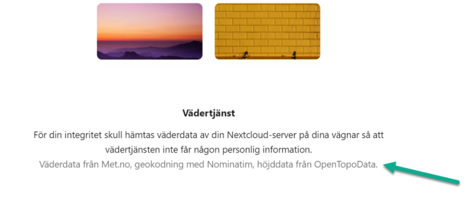
This one isn’t a WCAG-requirement, but it will be a severe problem for many users; many links aren’t visually differentiated from other text at all, they’re just black text. Without any visual way of identifying links, it’s just guesswork. For once a problem that only affects sighted users.
We strongly recommend that you use CSS to make sure all links are easily differentiated from other texts and use more than just color to do so.
Suggested solution
- Make sure to identify all links as such, using not only colour. For example using blue, underlined text.
Priority
High priority (2)
Affected user groups
- All users
WCAG 2.1 (AA) violations
- 1.4.1 Use of Color (level A)
1.4.11 Non-text Contrast
Problem description
Graphical objects that are necessary for the user to understand the interface or the content need to have a contrast ratio to their background of at least 3:1.
This includes things such as diagrams, icons, focus markers, and similar.
Unfortunately, there are many such objects with too low contrast. This makes it harder for users with low vision to see and identify such objects, which can be a difficult obstacle in using the service.
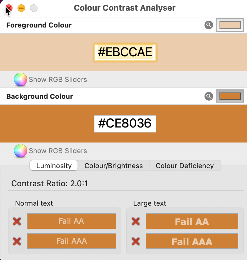
The white and orange colors used together in many places barely pass the contrast requirements here, but in some places, the white color is muted into a light orange color, and here the contrast is too low. We measure it to 2:1.
Keep in mind that the white and orange colors fail the contrast requirements for text, but you can find more information about that in 1.4.3.
We can see an example in the main menu. The active icon is white on orange, with an acceptable contrast level, but the inactive ones are more muted and fails the contrast requirement

Focus marker in login
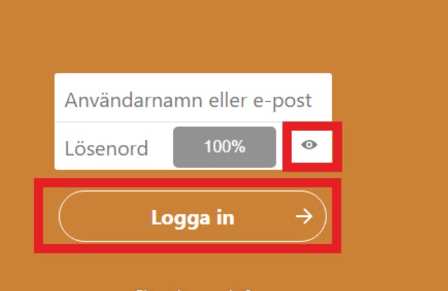
There’s an issue with the focus marker in the login where the marker in some places has too low contrast against the background, making it very hard to see.
We saw this problem for the button for hiding the password and the login button, they are marked in the screenshot below.
Talk app
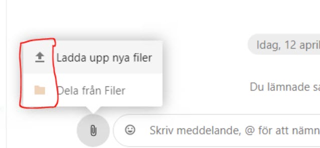
There’s a small pop-up meny for adding files to the chat, the icons there have too low contrast against the background. Since there are also texts it’s their contrast that counts for WCAG-compliance, not the contrast of the icons, but it would be better to improve the contrasts for the icons as well.
As they are now these icons look inactive, giving them better contrast will make it easier for the users to understand that they can activate these buttons.
A problem that is relevant to the WCAG-criterion is the frame around the chat field. There is text there as well, but it’s the frame that really shows the user where to enter text into the chat. And the contrast for that frame is too low against the white background.
This makes it unneccessarily difficult for users with low vision to see where to input text into the chat.
Filer app
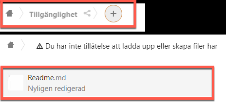
When navigating with the keyboard a visual marking shows where focus is. But this focus marker has too low contrast against the background making it very hard to see. When text is focused it often changes shade into a lighter grey, which is very subtle and hard to see, and lowers the contrast of the text against the background.
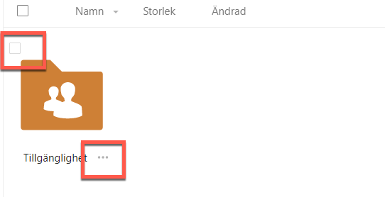
Checkboxes and grey dots in the app Files have too low contrast against the background.
Ikoner bredvid text i utfällbar meny för att bifoga filer saknar tillräckliga kontraster för grafiska objekt. Knapparna känns inaktiva då de inte har lika klar färg som mycket annat på sidan.
Aktiviteter app
The same issue with keyboard focus on interactive text objects, the text changes to a lighter shade of grey. Very hard to notice this change and the contrast against the background worsens.

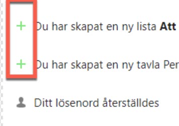
The green plus-icons have too low contrast against the background. It would generally be a good idea to look through all these icons and work to improve contrast values.
Kalender app
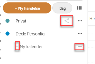
There is a several icons such as “…"-icons and plus-icons have too low contrast against the background, marked in the screenshot below.
Formulär app
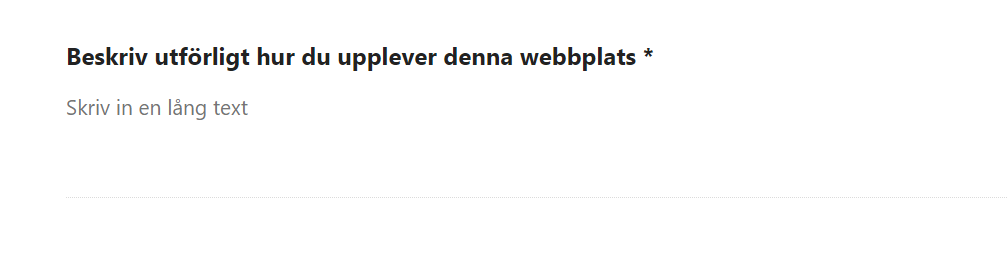
Input fields are shown with a thin, grey line with too low contrast to the white background.
Deck app
There are problems with the orange color when used on buttons, the contrast value is too low.
The focus marker is also practically non-existent when navigating in forms, making it very challenging to use them with keyboard navigation. Since even many users who mostly navigate using the mouse prefer to navigate with the keyboard in forms there would be benefits for many users to improve the focus marker here.
Suggested solution
Make sure all information thats presented visually have a contrast ratio of at least 3:1.
This includes for example input areas, visual focus, charts, icons etc.
Make sure to have a contrast of at least 3:1 on all graphical objects that the user needs to see to use the interface. To do so:
- Make icons darker to meet the contrast requirement
- Change the design in the menu. It should stil be clear which page is active, but all icons must have good contrast
- Improve contrast for form objects, preferrably use frames instead of lines
- Improve visual focus so it’s always easy to see and has a strong contrast against the background
Priority
High priority (2)
Affected user groups
- Color-blind users
- Low-vision users
WCAG 2.1 (AA) violations
- 1.4.11 Non-text Contrast (level AA)
1.4.3 Contrast (minimum)
Problem description
We did not use the hich contrast setting to test, but based our tests on the assumption that the standard settings should pass the AA-level of contrast requirements in WCAG 2.1.
For that text must have a contrast against it’s background of at least 4.5:1. For larger text the requirement is lower at 3:1.
If text fails this requirement it will be hard for many users to discern and read it.
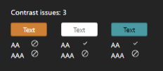
There are issues here where the colours orange and teal are used. This is a generall issue but we have some examples from different apps further down.
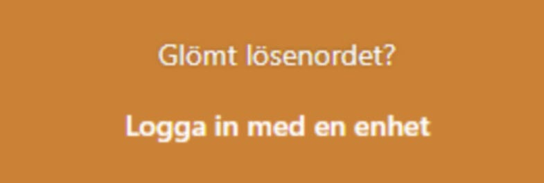
An example of white text on an orange background can be seen in the screenshot below from the login interface. We measured the contrast here to 3.1:1 which is too low for small text.
We also saw an issue on the start page where a white text was placed against ain image background giving too low contrast for parts of the text.

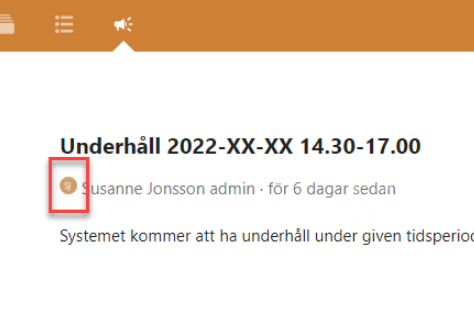
The users initials are occasionally shown as white text in a orange circle. The text has a contrast against its background of 2,4:1, which is too low. The example in the screenshot below is from the app Meddelanden.
Talk app
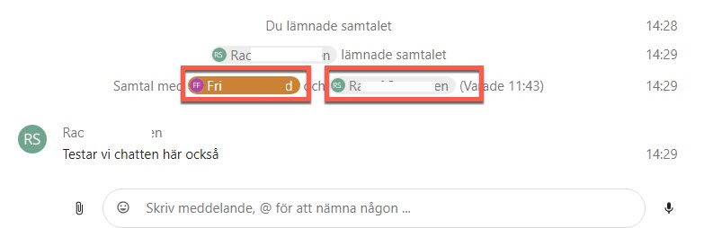
The white on orange is ok for larger text, but since it’s an issue with smaller text it might be bet to change this consistently even there. The teal text, whether against a grey or white background, has too low contrast even for larger text.
Filer app
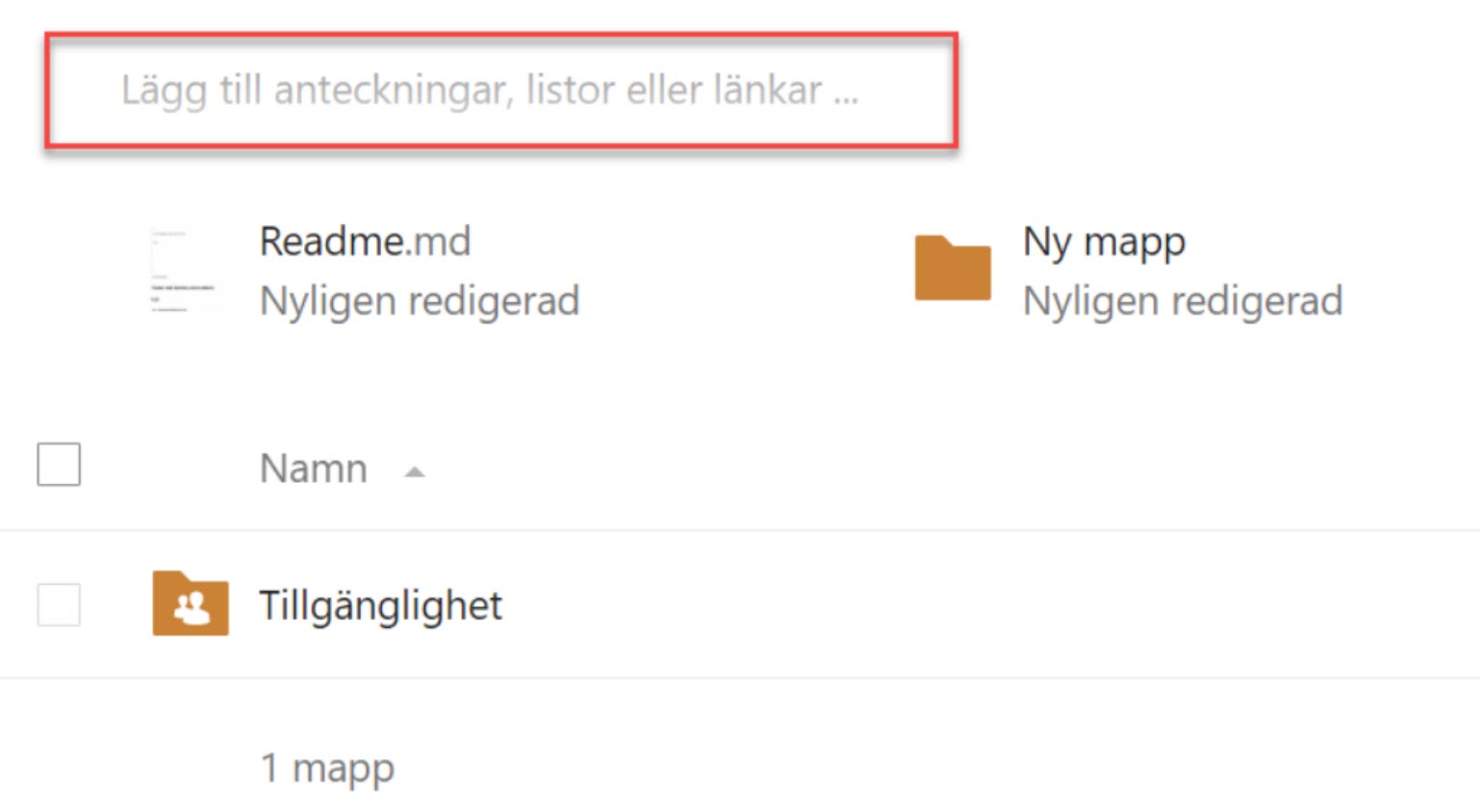
Placeholders are light grey against a white background which fails the contrast requirements.
This isn’t unique to this app. Making contrasts better in placeholders introduces new problems, since it can make users think that the field is already filled in. It’s generally better to use labels outside the field and avoid placeholder alltogether.
Kalender app
Buttons and date fields in the calendar view use white on orange, which fails the contrast requirements.
Formulär app
Orange texts used here as well, in the example below we measured the contrast against the background to 2.3:1.

Suggested solution
Change the contrasts for texts with the orange and teal colours, either by changing the texts or their backgrounds.
Contrast between text and it’s background should have a ratio of:
- 4.5:1 - Small text
- 3:1 - Text larger then 18pt
Avoid using text against an image background to avoid contrast issues.
Priority
High priority (2)
Affected user groups
- Low-vision users
- Color-blind users
WCAG 2.1 (AA) violations
- 1.4.3 Contrast (Minimum) (level AA)
2.4.4 Link Purpose (In context)
Problem description
There are general issues with links in the service, they’re not consistently designed and therefore often not very clear in their context. They’re often hard to differentiate from normal text, but though this is an issue it’s not covered by the WCAG-standard.
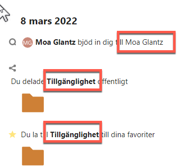
The link texts by themselves are often not enough to understand their purpose here, but the icons help. But since these icons aren’t communicated to screen reader users the links are very hard to understand for those users.
One solution would be to add words in the link text to make their goal clearer, words like Conversation or Folder could help screen reader users understand their purpose. If the icons would be a part of the text alternative texts on them could be used for the same purpose.
There are other UX-related challenges here as well that should be looked at from a broader perspective.
Suggested solution
- Complement links that has an icon with text, it can be visually hidden, that gives the same information as the icon
Priority
High priority (2)
Affected user groups
- Blind and visually impaired users with screen readers
- All users
WCAG 2.1 (AA) violations
- 2.4.4 Link Purpose (In Context) (level A)
2.4.6 Headings and labels
Problem description
Kalender app
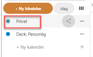
“Privat” can be both an event and a calendar, possibly even a “deck”. It’s all very generic. Changing these texts to be more specific would do a lot to make this interface more unserstandable. “My Calendar” to take an example.
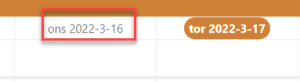
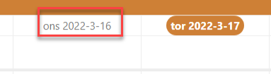
The date in the week menu show a date format with year, month, day, which is not the expected format.
Suggested solution
- Make sure that all labels clearly explain the function of their objects
Priority
High priority (2)
Affected user groups
- Blind and visually impaired users with screen readers
- Users with cognitive disabilities
- Novice users
WCAG 2.1 (AA) violations
- 2.4.6 Headings and Labels (level AA)
2.4.7 Focus Visible
Problem description
When navigating with the keyboard a visual marker shows where focus is. This marker must be easy to see and follow to make keyboard navigation as easy as possible.
Unfortunately, there are several interactive objects that are missing visual focus. In combination with issues with the focus order and poor contrasts, this makes it hard to navigate with the keyboard.
Focus must be shown on all interactive objects, and it must have a contrast of at least 3:1 ratio (See 1.4.11).
This is a consistent problem in the whole service that needs to be looked at as a whole.
Here are some examples of interactive objects that are missing visual focus:
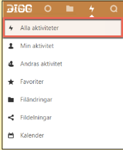
The active link in the side menu has no focus marker. So in the screenshot below we are on the “Alla aktiviteter”-page, that link is marked as currently active in the menu, but when we tabb to it there is nor marker showing focus.
It’s great that you mark the active link in the menu, but it needs to have a focus marker if it’s possible to tab to it.
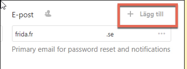
This screenshot is from the profile setting page. The “Lägg till” button below is missing visual focus.
The button for opening the side menu has different focus markings in different parts of the service. All of them use a hamburger icon and three parallel horizontal lines. Some examples of these focus markers are a light blue background or a light grey background with an orange frame. But most commonly they don’t have any focus marker at all.
To conform to the WCAG-standard these need to have a visible focus marker, but beyond that it’s also important that the focus marker is consistent. Consistency makes it easier for all users, but it’s especially important for some user groups.
Example from login
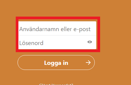
The text fields in the login do not have a focus marker. In the screenshot below we have marked them with a frame.
Kalender app
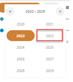
No focus marker is shown in the side menu, making it unusable for keyboard users.
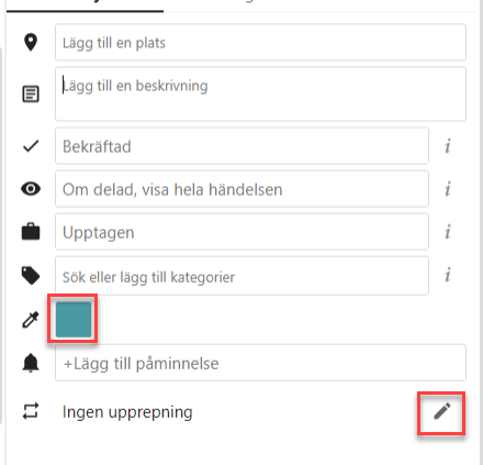
There are many objects without a focus marker in the fly-out. In the sceenshot below focus is on “Beskrivning” but only the text marker indicates that which is not enough for a text field.
The same issue is there for the modal window that opens in wider viewports.
There is no focus marker in the month and week views. Even when the tooltip for dates is shown after a delay it’s not enough.
Suggested solution
- Make sure that all interactive objects have a visual focus
- Make sure that visual focus is consistently designed
- Make sure that the focus has a contrast ratio of at least 3:1
Priority
High priority (2)
Affected user groups
- Users with motor impairments
- Low-vision users
WCAG 2.1 (AA) violations
- 2.4.7 Focus Visible (level AA)
3.3.3 Error suggestion
Problem description
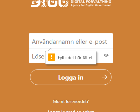
There are issues with the error message in the login form. In the screenshot below the automatically generated error message from the required-attribute is shown, which does not fail the WCAG-standard since it’s generated by the browser.
But there are still issues with it, it says that a field needs to be filled in but gives no guidance on how the user should fill it in.
But another issue does fail this success criterion, and that is the error message shown when the user has made a mistake in filling in the password or username fields. The message shown simply tells the user that there’s something wrong in these fields, with no information on which field the error is in or how to resolve it.
To make this more usable for the user make sure each field has its own separate error message, and give the user information on how to fix any problems. So for instance, if you notice that the user has entered an incorrectly formatted e-mail let the user know that.
Formulär app
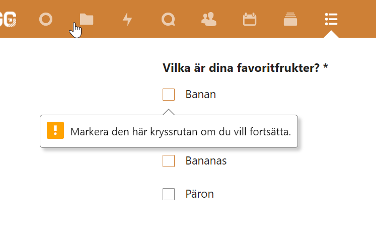
Using the required-attribute to generate error messages means that they might at times be misleading. In the example below the user need to choose one of the four checkboxes, but the error message simply says that the user must check the first one to continue. Since only the first object with this attribute gets an error message this can be quite confusing.
Suggested solution
- Design and implement custom error messages. They should tell what the issue is and how to resolve it where possible
- They must be connected to their form objects in the code
- Avoid using the required-attribute
Priority
High priority (2)
Affected user groups
- All users
WCAG 2.1 (AA) violations
- 3.3.3 Error Suggestion (level AA)
Medium priority
1.4.13 Content on hover or focus
Problem description
Tooltips - All apps
There are issues with the tooltips used in all the apps. We will show some examples here, but this needs to be addressed for the entire service.
Browser tooltips
There are different kinds of tooltips in use. Some of these are generated by the browser from the title-attribute of an object, These aren’t relevant to the WCAG-standard, browser generated tooltips are exempt, but it’s still problematic for some users.
These tooltips don’t work well with magnification or keyboard navigation. It’s recommended to implement your own tooltips instead and make sure they work well for all users.
Custom tooltips
For custom tooltips the WCAG-standard is relevant, and there are a few things that are needed to fulfil it:
- With the tooltip open the user must be able to move the mouse pointer to the tooltip without it disappearing
- It must be possible to close the tooltip without moving focus, for example by pressing Escape
- It must be shown until the user closes it or moves from the object that opened it
- It must work with keyboard navigation
- It must work well with screen readers
In some places, with a custom tooltip the tooltip disappears after some time. This fails the WCAG-standard and makes it harder for users to read the tooltip. The tooltips don’t work the same in all the places, and generally feel inconsistent.
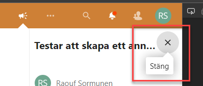
Make sure all tooltips follow the WCAG-standard, but there are two things to keep in mind beyond that:
Consistency
It would be best if all tooltips across the apps would work the same. Consistency is one of the best ways to make it easier for the user. If they learn how the tooltips work in one place it should be the same everywhere else.
Tooltip or not?
If the information in a tooltip is important for the user to understand the contents, consider just placing it directly on the page instead of hiding it in a tooltip.
Tooltips can be a good way of giving extra information or clarifying something, but if it’s important it’s usually better to always show it.
Information icon and time tooltips
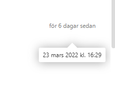
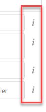
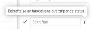
Information icons and times, for example, when a document last was changed, have got tooltips. But since these aren’t interactive objects they’re not reachable with the keyboard.
This is obviously an issue for users who navigate with the keyboard. But it’s hard for those who use the mouse as well, there’s no indication here that hovering over a time will show a tooltip.
It might be best to just write out the full text in these instances. For example “6 days ago. 23 March at 16:29.”
But the minimum here is to make sure that these tooltips work with keyboard navigation, if so it would also be good to make it more visually clear that these objects are somewhat interactive.
Consistent use
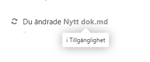
There’s also some inconsistency about when tooltips are used. We’ve seen tooltips used for filenames for example.
Vi ser också inkonsekvens vid användning av tooltips. Vi har hittat tooltips som ligger kvar vid exempelvis filnamn. Det här är ett modifierat title-attribut.
Tooltips - Kalender
This is where we first spotted problems with tooltips, but the issues here are generally the same as those mentioned earlier:
- Not usable with the keyboard
- Can’t move mouse to the tooltip without it closing
- Not possible to close without moving focus
Suggested solution
-
Use custom tooltips instead of browser generated ones
-
Don’t use tooltips when the information is important for the user to understand the contents
-
Make sure all tooltips look and work in a consistent manner
-
Make sure the following is true for all tooltips:
- With the tooltip open the user must be able to move the mouse pointer to the tooltip without it disappearing
- It must be possible to close the tooltip without moving focus, for example by pressing Escape
- It must be shown until the user closes it or moves from the object that opened it
- It must work with keyboard navigation
- It must work well with screen readers
Priority
Medium priority (3)
Affected user groups
- Blind and visually impaired users with screen readers
- Users with cognitive disabilities
- Users with attention deficit disorders
- Low-vision users
- All users
WCAG 2.1 (AA) violations
- 1.4.13 Content on Hover or Focus (level AA)
1.4.4 Resize text
Problem description
In most apps it worked well using browser magnification to zoom to 200 precent. But in Kalender, Meddelanden and Formulär there wer issues.
Kalender app
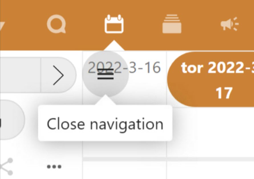
At 200 precent zoom, the button for open in the side menu overlaps the contents of the page. It doesn’t make it impossible to use, but it makes it harder to discern the contents blocked by it.
Meddelanden app
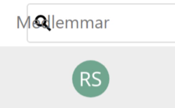
The search field overlaps with other content at 200 precent zoom.
Formulär app
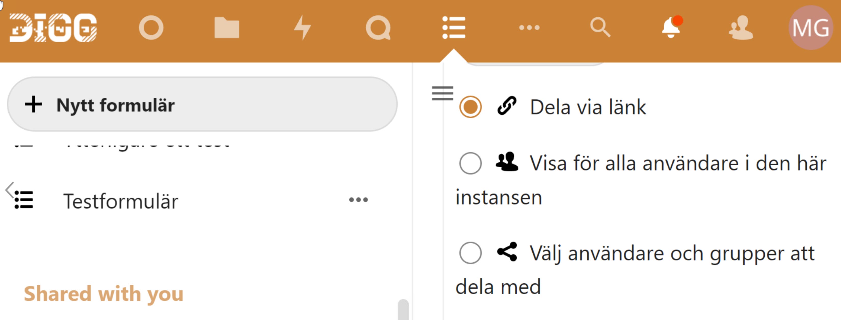
Some parts overlap and some parts of the interface are cut off by other ones at 200 precent zoom.
Suggested solution
- Make sure no parts of the interface overlap and no parts are cut off at 200 precent zoom.
Priority
Medium priority (3)
Affected user groups
- Low-vision users
- Elderly users
WCAG 2.1 (AA) violations
- 1.4.4 Resize text (level AA)
2.1.4 Character key shortcuts
Problem description
Talk app
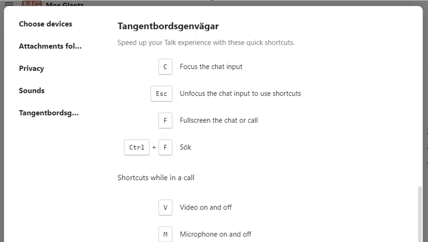
There are keyboard shortcuts for activating different functions in the Talk app. Shortcuts such as these can interfere with shortcuts used by some assistive technologies.
To follow the WCAG-requirements, and make sure that this can work with these assistive technologies the best option would be to give an option to turn off these shortcuts.
You could also make it so the shortcuts are only active when the user has focused on the area they affect.
We also recommend that you test to make sure the shortcuts don’t interfere with screen reader commands in particular.
Suggested solution
- Give an option to turn off keyboard shortcuts
- Set them to only be active when the user is in the area they affect
- Test so the shortcuts don’t interfere with screen reader commands
Priority
Medium priority (3)
Affected user groups
- Blind and visually impaired users with screen readers
WCAG 2.1 (AA) violations
- 2.1.4 Character Key Shortcuts (level A)
2.4.1 Bypass blocks
Problem description
There need to be ways of bypassing blocks of content that are repeated on several pages, such as a menu. Unfortunately, there are serious issues here. There are shortcuts for bypassing blocks of content in several apps, but they only work in Filer och Aktiviteter. In the other apps, they don’t work, the user can sometimes activate them, but nothing happens.
All apps have two shortcuts, one to the navigation and one to the main content.
Meddelanden app
Both shortcuts are present, but there is no navigation, making the shortcut to the navigation redundant.
Formulär, Talk, Kalender and Deck app
The shortcuts are present but doesn’t work.
Suggested solution
- Make sure all shortcuts past blocks of content work as they should
- Make sure there are no redundant shortcuts
Priority
Medium priority (3)
Affected user groups
- Users with motor impairments
- Blind and visually impaired users with screen readers
WCAG 2.1 (AA) violations
- 2.4.1 Bypass Blocks (level A)
3.2.2 On input
Problem description
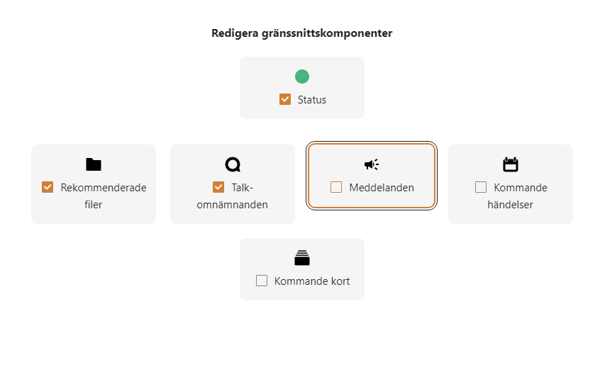
In the modal for adapting the start page, there are checkboxes representing different components that the user can add to the start page. When a component is checked it moves to a list of selected components. So if check the component “Kommande kort” it would be moved to be in front of “Meddelanden”.
Since this changes the context just from the user checking a checkbox this fails criterion 3.2.2, and it will be very confusing to screen reader users who cannot see this change.
Vi recommends that you don’t move things around here. Place the components in a list and let the user go through them as they please.
Suggested solution
- Don’t move the components around, place them in a list and keep them there
Priority
Medium priority (3)
Affected user groups
- Blind and visually impaired users with screen readers
- Users with motor impairments
WCAG 2.1 (AA) violations
- 3.2.2 On Input (level A)
3.2.4 Consistent identification
Problem description
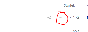
Icons with three dots are often used to signify that the user can activate them to open a menu with settings, tools, or alternatives for the relevant object. The names for these objects are inconsistent, both in what they’re called and in what language is used for their name, sometimes Swedish and sometimes English.
Some examples of the names we’ve seen are “options”, “actions” “åtgärder”. These need to be consistently named.
This problem exists in all the apps.
Apart from this being inconsistent, the names used for them often aren’t even correct. This makes it very hard for screen reader users to understand what these buttons do.
Filer app
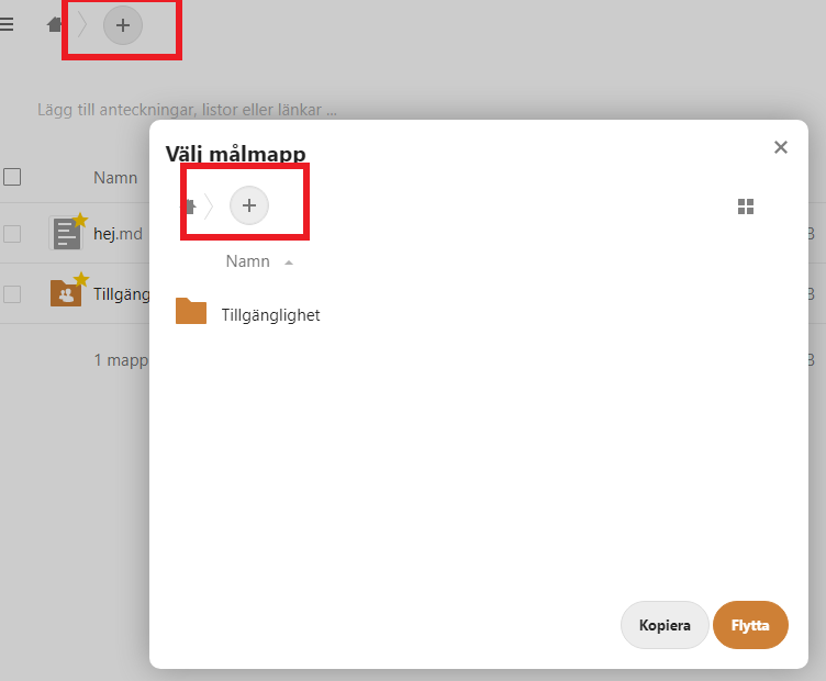
There is a navigation tree for files and folder structures that can be found in several places in the interface. There are buttons with a plus-icon here that aren’t consistently named.
In the screenshot below the plus-button in the modal doesn’t have a name at all, but the identical icon on the page below has got a name.
Remember that consistent naming doesn’t necessarily mean identical naming. If these buttons add different things they could be named “Add folder”, “Add document” for instance, at it would be consistent since their function of adding something would be consistently explained.
Meddelande app
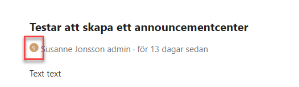
The button with the users initials that can be seen in the chat leads to the users profile. But its accessible name is “Åtgärder”, which isn’t correct, but it’s also inconsistent with other links to the user profile, failing this success criterion.
Make sure interactive objects that lead to the same place are named consistently.
One thing that goes beyond the WCAG-requirements, but is still worth considering, is that the initial button is visually identical across apps, but isn’t consistent functionally. Generally speaking, it’s best if objects that look the same way work the same way.
Suggested solution
- Always make sure that an object’s accessible name identifies it and makes it easy to understand its function, and when necessary differentiates it from other, similar, objects
- Make sure interactive objects that lead to the same place are named consistently
- Make sure that objects that look the same way work the same way
Priority
Medium priority (3)
Affected user groups
- Blind and visually impaired users with screen readers
- Users with cognitive disabilities
- Novice users
WCAG 2.1 (AA) violations
- 3.2.4 Consistent Identification (level AA)
3.3.1 Error Identification
Problem description
We recommend that you customize a consistent way of showing error messages in the service. It should communicate to the user what is wrong and where, and should be consistent in design and function.
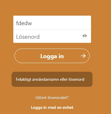
In the example below the user has entered their information, activated the login-button, and the error message “Felaktigt användarnamn eller lösenord” is shown under the login button.
The error message here doesn’t specify which field is wrong, it’s not visually placed with the fields, nor is it connected in the code.
It must always be easy to understand what’s wrong, where the issue is, and how to resolve it. For this the text in the error message is important, but its placement is also critical. And the error message must be connected in the code with its relevant field, for example with aria-describedby.
Formulär app
The following does not fail the WCAG-criterion, but it is a recommendation according to best practice.
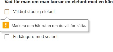
In many places, the required-attribute is used to validate and generate error messages, but there are issues with how this attribute functions:
- The error message shown with this attribute disappears after a while, which makes it harder for users with short-term memory issues.
- The message shown isn’t always relevant to the situation, in the screenshot below for instance choosing one of the checkboxes would be enough but the message says that the user must choose a specific one
- The error message is only shown for one object at a time
- Some assistive technologies might not find the error message
As mentioned earlier our recommendation is that you design and implement custom error messages. That way you would not need to rely on the required-attribute, the design will be consistent with other parts of the service and it will work better for the users.
Suggested solution
Design and build error messages that:
- Show which element they’re relevant for
- Clearly explains what’s wrong, and when possible how to resolve it
- Remain on the page until the user has resolved them
- Use these instead of the required-attribute
Priority
Medium priority (3)
Affected user groups
- All users
- Blind and visually impaired users with screen readers
- Novice users
- Users with cognitive disabilities
WCAG 2.1 (AA) violations
- 3.3.1 Error Identification (level A)
3.3.2 Labels or instructions
Problem description
In general, most input fields lack label-texts. Placeholders are used instead, but since that text disappears as soon as the user starts to type in the field this is not enough to comply with this success criterion.
There are also contrast issues with placeholder texts, and when improving contrasts it can make the user think the field is already filled in. So avoiding placeholder texts, in general, tends to be a good idea.
Talk app
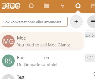
The search field in the Talk app does not have a visual label, only a placeholder text.
Every input field must have a visible label text. An exception is often made for search fields, but when it’s not a standard search-function, like here where the search is for conversations and users, a visible label is needed to clarify this.
It’s also worth noting that even though search fields are often excepted, no such exception exists in the WCAG- or EN 301 549-standards.
Deck app
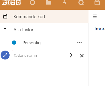
Below are two screenshots showing fields that only use placeholder-texts. Here the texts are quite dark, which is good for contrasts, but makes it look like the fields are already filled in.
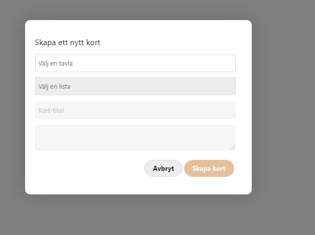
Meddelande app
Another example from the app Meddelanden.
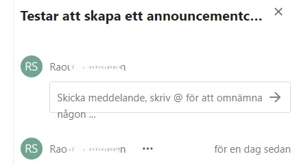
Formulär app
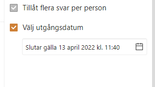
In the flyout for forms, there is a checkbox that opens a text field for entering a final date for the form. This uses a placeholder with the text “Utgångsdatum”. A label text should be used here instead.
Keep in mind that the names for the checkbox that opens the field and the field instead must be different. So the checkbox should use its visual text “Välj utgångsdatum” (“Choose a final date”), while the field instead could have “Final date” as its label text.
Suggested solution
- Use visual labels for all input fields and other form objects
- Don’t rely on placeholder texts, use labels instead
Priority
Medium priority (3)
Affected user groups
- Users with attention deficit disorders
- Users with cognitive disabilities
- Elderly users
- Novice users
WCAG 2.1 (AA) violations
- 3.3.2 Labels or Instructions (level A)
4.1.1 Parsing
Problem description
We could see that there are a number of validation errors that can cause accessibility issues. Among other things, there are several elements with identical ID-values.
There are also validation errors regarding code semantics that doesn’t follow the standard.
We had limited means to validate the code but we can affirm that there are issues that fail the WCAG-standard.
The following validation errors aren’t allowed in the WCAG-standard:
- Elements have complete start and end tags
- Elements are nested according to their specifications
- Elements do not contain duplicate attributes
- Any IDs are unique
It is worth keeping in mind that other validation errors can also cause accessibility problems. But these four are very likely to do so.
It’s generally best to keep a website’s code as close to standard as possible. This makes it more robust and minimizes risks for errors when assistive technologies interact with it.
We list some serious issues below, but there are more. We recommend that you validate the code, control that it’s semantically correct, and fix as many issues as possible.
Talk app
Some examples from the Talk app:
- Elements without end tags
- Button-elements nested in other buttons or link-elements
- Div-elements nested in list-elements
- li-elements nested in span-elements
- Use of negative tab-index on interactive elements
- Elements with identical id-values
Kalender app
- Elements with identical id-values
- svg-elements with alt-attributes
- li-elements outside of ul/ol-elements
Deck app
As shown below, a button nested in a list-element nested in another button.
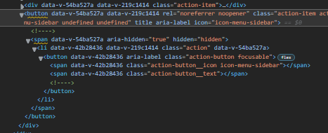
Another example below is a button in a list-element in a span in a button. The span has aria-hidden=“true” to hide it from screen readers, making anything in it impossible to reach with a screen reader. But even without that this has a high risk of causing issues for users with assistive technologies.
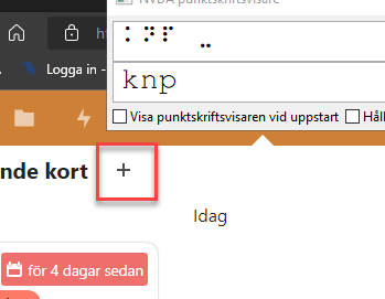
Lägg till kort
Suggested solution
- Validate the code and fix as many issues as you can, but especially any of the four that fail this WCAG-criterion
- Follow standard as much as you can and validate anytime you build something new
Priority
Medium priority (3)
Affected user groups
- Blind and visually impaired users with screen readers
WCAG 2.1 (AA) violations
- 4.1.1 Parsing (level A)
4.1.3 Status messages
Problem description
When the user starts typing in a search field some results are shown immediately. To follow this success criterion screen reader users must be notified that there are search results, and how many there are, the status of the search. But it’s important that this information is not conveyed while the user is still typing, as this can be very disturbing. Using aria-live=“polite” is a good way oh handling it.
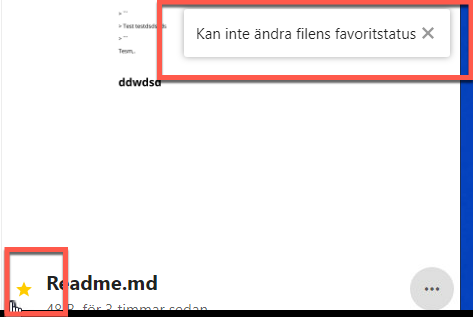
There are other places as well in the service where status messages are shown, but they’re never read by screen readers. An example is shown in the screenshot below where the user has tried to uncheck the favourite icon for a file and a message says that the user can’t change this setting.
Making sure that status messages are read when appropriate by screen readers is a vital part in making a service such as this accessible for screen reader users.
In the profile settings page, a verification symbol is used to verify when the user inputs personal data. This verification symbol is not communicated to screen readers. This and similar interactions need to work well for screen reader users and so need to be communicated. Again, aria-live is a good way of doing this. These also lack descriptions, more on that in 1.1.1.
The screenshot below shows the verification symbol.
Filer app
Status messages for changes to the files and folders aren’t communicated to screen reader users.
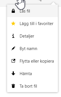
There is a visual status message, but it needs to be communicated to screen reader users.
Talk app
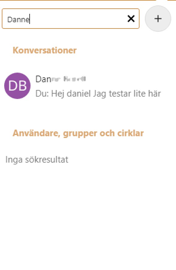
When searching for a conversation the search results change dynamically, but screen reader users aren’t notified that there are search results.
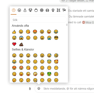
The same is true when searching for emojis.
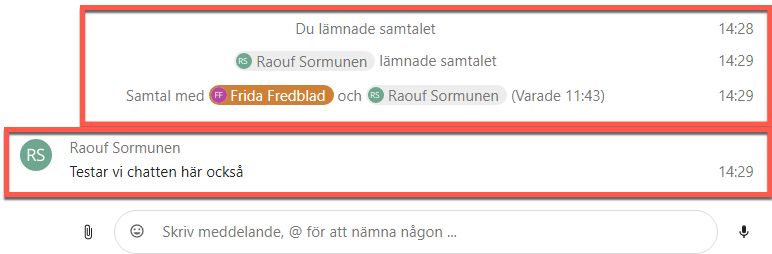
Status changes in the chat are communicated visually, but they’re not communicated to screen reader users. This includes such things as new messages, when a conversation ends, and such.
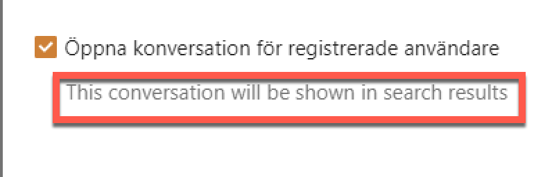
Some checkboxes open new areas with status messages that must be communicated to screen reader users.
Kalender app
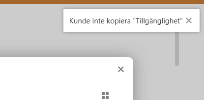
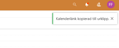
When copying a calendar link a status message informs the user that the action was successful. This is not communicated to screen reader users.
Deck app
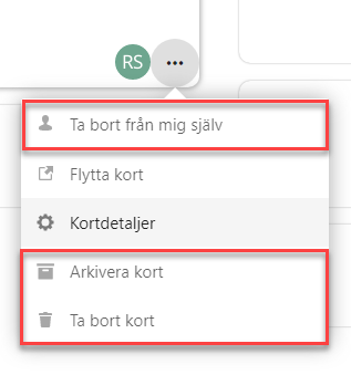
When an effect of an action is communicated to the user by something visually happening in the interface it must also be communicated to screen reader users without moving focus.
When making changes such as removing a card or making other changes you can use aria-live to communicate the change. “Card ‘My card’ removed” or “Card ‘Much work’ assigned to me” for instance.
It’s also important that the focus order should be correct here. See more in 2.4.3.
Formulär app
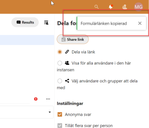
Status messages are shown when copying links, these status messages are not communicated to screen reader users.
Suggested solution
When the result of an action is shown without reloading the page, such as the results of a search, make sure any messages regarding the results are read to screen reader users without moving focus.
This can be done by adding aria-live=“polite” to the text. When the contents are changed they will be read to the user.
Priority
Medium priority (3)
Affected user groups
- Blind and visually impaired users with screen readers
WCAG 2.1 (AA) violations
- 4.1.3 Status Messages (level AA)
Low priority
1.3.2 Meaningful Sequence
Problem description
This is generally speaking ok, we did not see anything that fails the WCAG-standard. But there are places where it could be challenging to keep things in a logical order and make sure reflow works as expected. We would recommend that you be extra careful when it comes to these areas:
- The side menu on the left
- The contextual fly-out menu on the right
- Modal windows
Suggested solution
Make sure the all parts of the interface are presented in a logical order both visually and in the DOM-structure.
Take especial care for:
- The side menu on the left
- The contextual fly-out menu on the right
- Modal windows
Priority
Low priority (4)
Affected user groups
- Blind and visually impaired users with screen readers
- Users with motor impairments
WCAG 2.1 (AA) violations
- 1.3.2 Meaningful Sequence (level A)
1.4.10 Reflow
Problem description
Since focus is on desktop reflow isn’t a critical issue. But if a goal in the future would be to make the service work better on mobile devices this would need to be addressed.
The WCAG requirement for Reflow is:
Content can be presented without loss of information or functionality, and without requiring scrolling in two dimensions for:
- Vertical scrolling content at a width equivalent to 320 CSS pixels
- Horizontal scrolling content at a height equivalent to 256 CSS pixels
Except for parts of the content that require two-dimensional layout for usage or meaning.
This generally works, but we found problems in two apps.
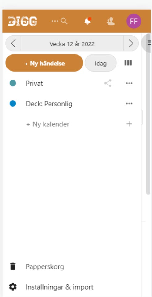
Kalender app
When using the Kalender app on a smaller, vertical screen and activating “Ny händelse” a fly-out menu opens from the right. This should open on top of interface, but it opens under the menu field, and the user won’t be able to reach it.
This does not technically fail this WCAG-criterion, though it would be a serious issue for someone trying to use the Kalender app on a mobile phone.
Deck app
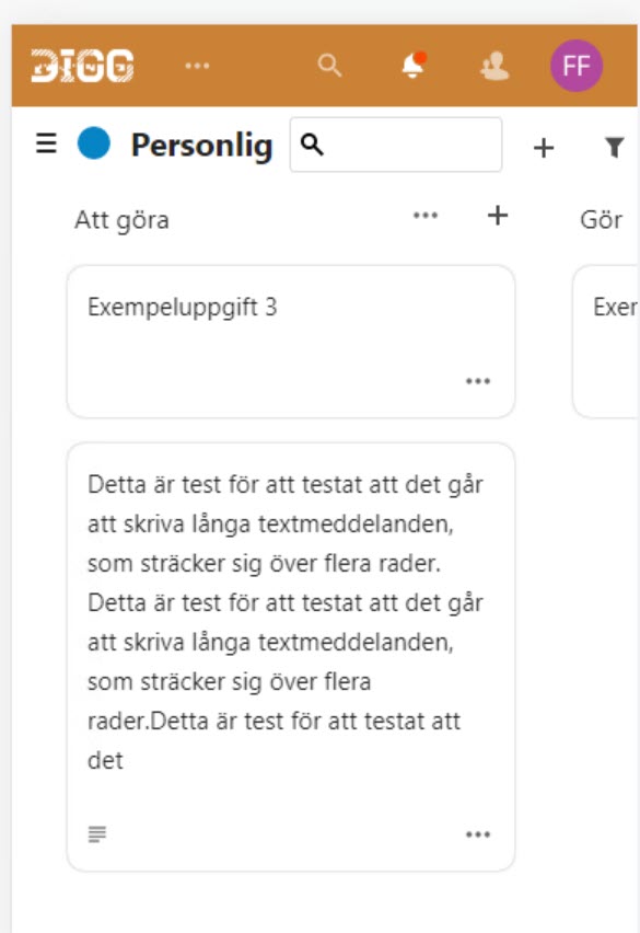
When using the Deck app on a smaller screen the user has two scroll in two directions to reach all the content, which fails this WCAG-criterion.
Suggested solution
- Make sure the interface can be used on smaller screens wihout loss of content and without requiring scrolling in two directions according to the WCAG-criterion.
Priority
Low priority (4)
Affected user groups
- Low-vision users
- Users with motor impairments
WCAG 2.1 (AA) violations
- 1.4.10 Reflow (level AA)
1.4.12 Text spacing
Problem description
Users might change how text is shown in their browser, so it’s important that this doesn’t break the contents or functionality of the service. It’s ok if everything doesn’t look at its best, but no content should be hidden or stop working.
This is especially important for users who have issues with reading text, such as those with dyslexia.
Mostly this was fine in our test, but we found problems in a couple of the apps.
When addressing this issue you can test it by using a text spacing bookmarklet for accessibility testing. There are several that work very well.
Kalender app
One of the buttons for changing what dates are shown in the calendar view is cut off vertically. It’s still possible to use, but it makes it harder to understand its function.
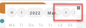
Talk app
Only half the name of the person you’re talking with is shown, it’s cut off horizontally. If you’re unsure you could ask the person for their name, but this really should just work.
Suggested solution
- Make sure every part of the interface and all contents are shown when text spacing is activated.
Priority
Low priority (4)
Affected user groups
- Users with cognitive disabilities
WCAG 2.1 (AA) violations
- 1.4.12 Text Spacing (level AA)
2.5.3 Label in name
Problem description
Formulär app
The accessible name of an object, the text that identifies it to screen reader users, should match the visual text for it. If it needs to be longer than the visual text, it must begin with the visual text.
We found an issue with the button “Verkställ” which has the accessible name “Skicka in formulär” through the aria-label attribute. This is completely different from the visible text, making this button very hard to activate using voice commands.
If this button is for sending in the form the visual text should match that.
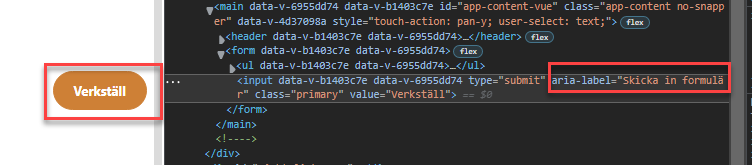
Suggested solution
- Change the button “Verkställ” so the visual text and the accessible name matches
Priority
Low priority (4)
Affected user groups
- Blind and visually impaired users with screen readers
- Users with motor impairments
WCAG 2.1 (AA) violations
- 2.5.3 Label in Name (level A)
3.1.2 Language of parts
Problem description
In many places of the service, we found texts that are partly in English. This might be that some parts haven’t been translated, that automatic systems get standard texts, or that they’re left for the browser to set.
When a language other than the main language of the page is used this must be set in the code. That way assistive technologies that read the contents of the page to the user know which language to read in.
Naturally, if the system is in Swedish it’s for the best if that language is used everywhere unless there are specific reasons to use another language.
Talk app
There are some texts in forms that are in English, this is not set in the code.
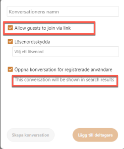
Kalender app
The button for opening and closing the side menu has a tooltip in English.
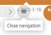
Suggested solution
- Use the main language of the website wherever possible
- When using another language, set the correct language in the code. This is required for WCAG-compliance
Priority
Low priority (4)
Affected user groups
- Blind and visually impaired users with screen readers
- Low-vision users
WCAG 2.1 (AA) violations
- 3.1.2 Language of Parts (level AA)