
1.3.1 Info and relationships
Heading structure
Using a correct heading structure facilitates navigation for screen reader users. It helps those users to understand the structure of the page content.
Headings should present the information structure to the user in an easy-to-understand way. To do that all headings must be marked up as such, their heading levels in the code should match the logical level they serve in the information structure, and the headings must never skip a level.
When it comes to this type of system, there may be some challenges in following a correct heading structure, due to the different functionalities and structures of the pages. But it is important to find practical solutions here.
We can see that to some extent hidden headings have been used to support screen reader users. This can be a good way of solving pages where it would be difficult to use visual headings. But in most places, many users can benefit from visible headings so this solution should be used with caution.
Unfortunately, there are issues with the headings on several pages:
- Headings aren’t structured correctly to match the information structure
- In some places, headings skip levels
- Some headings aren’t marked up as such in the code
- Some content that aren’t headings are coded using heading-elements
This all makes the content structure very hard to understand for screen reader users.
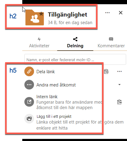
In the image below the functions under the input field are coded as h5 but visually they aren’t headings but buttons. If the content doesn’t function as headings, don’t code them as such.
Heading elements or aria-headings
Headings are sometimes built using h-elements, but sometimes they’re made using WAI-ARIA instead. We recommend that you use h-elements wherever possible. It’s a more robust solution and the best way to make it compatible with as many assistive technologies as possible.
Deck app
There are some examples of issues with the heading structure in the Deck app as well.
The headings don’t skip levels here, but they don’t match the logical structure of the content. To take an example the heading “Kommande kort” isn’t related to the different lists on the overview page, “Today”, “Tomorrow” and such. In the middle of this list, there is also a hidden heading saying “Denna tavla är skrivskyddad” (“This board is read only”) which doesn’t make any sense as a heading.
In “Egna tavlor” the heading structure is even more illogical. “Börja skriva för att söka” is a heading by the search function, which isn’t needed and can be confusing for users, there’s a visually hidden heading “Släpp dina filer för att ladda upp” that is above all the cards in the structure. These texts are instructions, they should not be coded as headings.
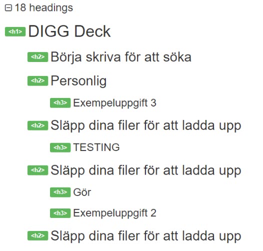
When the flyout is open there is a problem with skipped heading levels, as it goes directly from a heading level 3 to one at level 5.
Drop-down
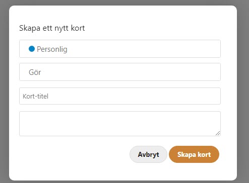
There are hybrid objects in the modal window for creating a new card, they’re select fields that the user can also type in.
Unfortunately, they don’t work well with screen readers. When pressing the down arrow to move down to the select options the focus moves visually, but the screen reader only reads any text written in the field or “Empty” if the field is indeed empty.
This needs to be changed so it works with screen readers and thoroughly tested.
Label not connected to form-element
A label and the form-element it identifies must be connected in the code. That way users with assistive technology such as screen readers can easily understand the purpose of the form-element.
Unfortunately, we saw several places where labels and their form-elements aren’t connected, making them challenging to use for screen reader users.
Filer app
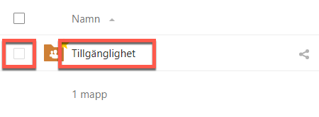
Here the checkbox does not give information on which folder it controls. If there were several folders here it would be very hard to understand which checkbox belongs to which folder. An aria-label on the checkbox stating it’s function and which folder it belongs to would solve the issue.
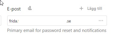
In profile settings, the E-mail label and input fields aren’t connected in the code. Using the for-attribute on the label-element to connect it to the input field is the standard way of doing this.
You also need to make sure that the message under the input field is read by screen readers in association with the field. One way of doing this is to use aria-describedby on the input field and reference the id of the text under the field.
Formulär app
The same thing is true here as well, using the for-attribute will solve it.

Messages app
There’s a menu that can pop in from the side, and the form fields there aren’t connected to their label texts.
Table structure
In the Files app there are tables that aren’t coded correctly. Tables need to have a connection between table headings and data cells. Using table headings for all relevant headings, and using scope set to col or row will make tables understandable to those using screen readers.
Remember, when you use interactive elements in tables you also must consider accessible names for the interactive elements.
File locked or not
When a visual indicator is important for the users interaction with an object, there should be a text explanation at the object to relay this information to the user.
In the File app a lock-icon shows when a file is locked and can’t be opened. But if the user can’t see the icon they won’t understand why they can’t open the file. Make sure to add the locked status to the accessible name of the interactive element. So in the example below, we could use aria-describedby connected to the id of the lock icon to connect it to the file name.
Unfortunately, the lock icon doesn’t have an alternative text, so it wouldn’t be read anyway, but more on that in 1.1.1.

Chat - message info
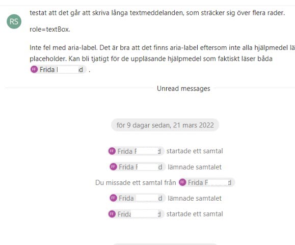
When using the chat with a screen reader it’s very hard to understand which name and timestamp belong to each message. These must be connected so the user easily can understand which name and timestamp correspond to which message.
It would be worth looking into how to do this the best way, but using aria-describedby on the message to connect it to the name and timestamp would be one way to do it. User testing would be beneficial here to make sure the connection is understandable.
Buttons do not explain context
Many buttons in the interface have very generic accessible names. This makes it very hard to understand the difference between similar buttons, and what parts of the interface they’re connected to in the context.
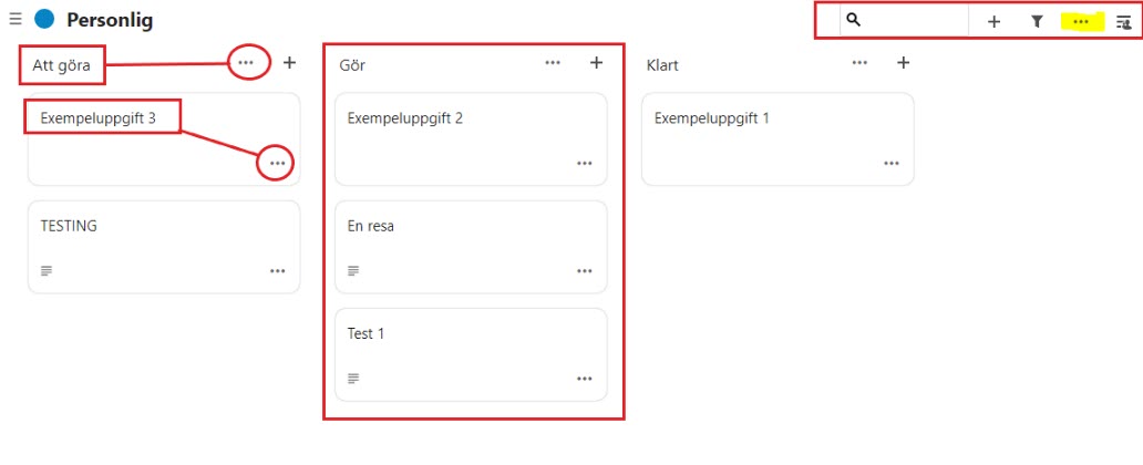
Take the screenshot below from the Deck app. All the “…"-buttons have the same accessible name, this makes it nearly impossible for screen reader users to guess their function in the interface.
Make sure all accessible names explain the function of interactive elements clearly, including any context necessary to understand.
Fieldset and legend
Fieldset and legend can be used to programmatically connect a heading to a group of form objects. This is a good way to group form objects together in logical groups, like delivery address and invoice address.
We’ve seen a few places where fieldset and legend need to be implemented to make the function of form objects easily understandable to screen reader users.
Kalender app
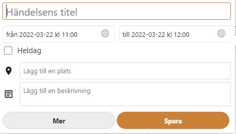
The fields and dropdowns in the fly-out for “Ny händelse” could be organized using fieldset and legend. This is for the form itself, not the tabs.
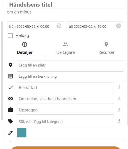
In the modal window for adding events there is also a form that should be grouped.
Deck app
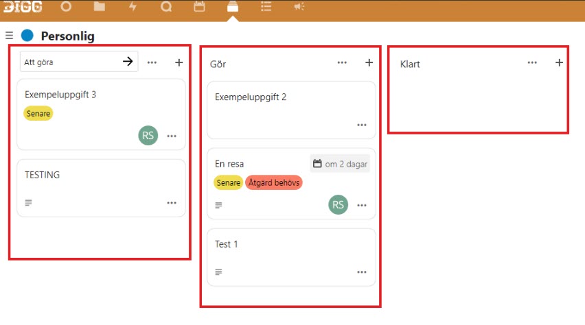
Another example can be found in the Deck app. Here the fields are divided into three columns. Using fieldsets around these, with visible headings in legend-elements will connect each form object in each fieldset to its legend-attribute, making this interface a lot easier to understand and use for screen reader users.
Layout table
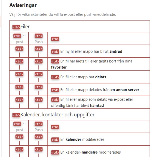
When selecting options for notifications in the app Activities the layout uses a table. The WCAG-standard does not forbid using tables for layout, though it strongly recommends using CSS for layout instead.
If you want to use a table here, you should avoid using any semantic table elements, such as th-elements, though td-elements are ok, since assistive technology doesn’t rely on differentiating them from standard text-elements.
But we recommend that you use CSS for the layout here instead.
Drop-downs and screen readers
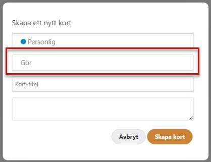
In the Deck app there are some form fields that work as hybrid input fields and select-elements. When the user activates it a selection of choices is shown, but the user can also write their own text in the field.
Unfortunately, the select functionality here does not work with screen readers. The screen reader will only read what’s written in the field, but won’t read the options in the select-options. When the user presses down arrow the focus marker moves down into the options, but they’re not read by the screen reader, instead, it just says what the user has written in the field or “Empty” if the field is empty, likely the screen reader focus does not move down with the keyboard focus.
If a hybrid field should be used here it must be done in an accessible way and work well for both keyboard navigation and screen reader users.
In the screenshot below the marked field is a hybrid field, we wrote “Gör” in it.
Login page
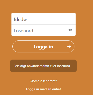
An error message can be shown but it’s not connected in the code to the fields it concerns. Making separate error messages for username and password would make this easier to implement and easier for users to understand.
- Use h-elements for all headings
- Use a correct heading structure that matches the information hierarchy on the page
- Don’t skip heading levels
- Associate the for-attribut in labels to the ID of the input field.
- We recommend to go through the code making sure all relations that can be made visually also have a semantic association in the code
- Use h-elements rather than WAI-ARIA for headings wherever possible
- Build correct tables using th-elements for column and row headings, using scope attributes set to col or row
- Don’t use tables for layout, use CSS for that