
1.4.13 Content on hover or focus
Tooltips - All apps
There are issues with the tooltips used in all the apps. We will show some examples here, but this needs to be addressed for the entire service.
Browser tooltips
There are different kinds of tooltips in use. Some of these are generated by the browser from the title-attribute of an object, These aren’t relevant to the WCAG-standard, browser generated tooltips are exempt, but it’s still problematic for some users.
These tooltips don’t work well with magnification or keyboard navigation. It’s recommended to implement your own tooltips instead and make sure they work well for all users.
Custom tooltips
For custom tooltips the WCAG-standard is relevant, and there are a few things that are needed to fulfil it:
- With the tooltip open the user must be able to move the mouse pointer to the tooltip without it disappearing
- It must be possible to close the tooltip without moving focus, for example by pressing Escape
- It must be shown until the user closes it or moves from the object that opened it
- It must work with keyboard navigation
- It must work well with screen readers
In some places, with a custom tooltip the tooltip disappears after some time. This fails the WCAG-standard and makes it harder for users to read the tooltip. The tooltips don’t work the same in all the places, and generally feel inconsistent.
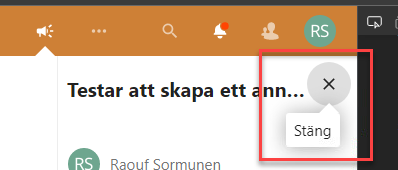
Make sure all tooltips follow the WCAG-standard, but there are two things to keep in mind beyond that:
Consistency
It would be best if all tooltips across the apps would work the same. Consistency is one of the best ways to make it easier for the user. If they learn how the tooltips work in one place it should be the same everywhere else.
Tooltip or not?
If the information in a tooltip is important for the user to understand the contents, consider just placing it directly on the page instead of hiding it in a tooltip.
Tooltips can be a good way of giving extra information or clarifying something, but if it’s important it’s usually better to always show it.
Information icon and time tooltips
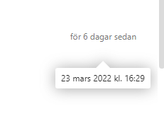
Information icons and times, for example, when a document last was changed, have got tooltips. But since these aren’t interactive objects they’re not reachable with the keyboard.
This is obviously an issue for users who navigate with the keyboard. But it’s hard for those who use the mouse as well, there’s no indication here that hovering over a time will show a tooltip.
It might be best to just write out the full text in these instances. For example “6 days ago. 23 March at 16:29.”
But the minimum here is to make sure that these tooltips work with keyboard navigation, if so it would also be good to make it more visually clear that these objects are somewhat interactive.
Consistent use
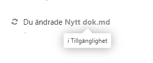
There’s also some inconsistency about when tooltips are used. We’ve seen tooltips used for filenames for example.
Vi ser också inkonsekvens vid användning av tooltips. Vi har hittat tooltips som ligger kvar vid exempelvis filnamn. Det här är ett modifierat title-attribut.
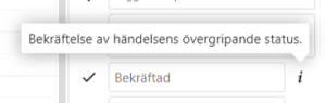
Tooltips - Kalender
This is where we first spotted problems with tooltips, but the issues here are generally the same as those mentioned earlier:
- Not usable with the keyboard
- Can’t move mouse to the tooltip without it closing
- Not possible to close without moving focus
-
Use custom tooltips instead of browser generated ones
-
Don’t use tooltips when the information is important for the user to understand the contents
-
Make sure all tooltips look and work in a consistent manner
-
Make sure the following is true for all tooltips:
- With the tooltip open the user must be able to move the mouse pointer to the tooltip without it disappearing
- It must be possible to close the tooltip without moving focus, for example by pressing Escape
- It must be shown until the user closes it or moves from the object that opened it
- It must work with keyboard navigation
- It must work well with screen readers