
3.3.2 Labels or instructions
In general, most input fields lack label-texts. Placeholders are used instead, but since that text disappears as soon as the user starts to type in the field this is not enough to comply with this success criterion.
There are also contrast issues with placeholder texts, and when improving contrasts it can make the user think the field is already filled in. So avoiding placeholder texts, in general, tends to be a good idea.
Talk app
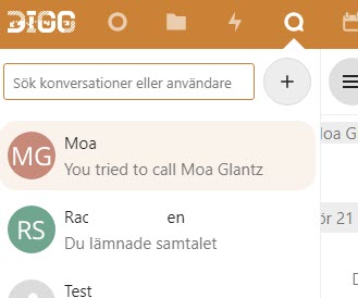
The search field in the Talk app does not have a visual label, only a placeholder text.
Every input field must have a visible label text. An exception is often made for search fields, but when it’s not a standard search-function, like here where the search is for conversations and users, a visible label is needed to clarify this.
It’s also worth noting that even though search fields are often excepted, no such exception exists in the WCAG- or EN 301 549-standards.
Deck app
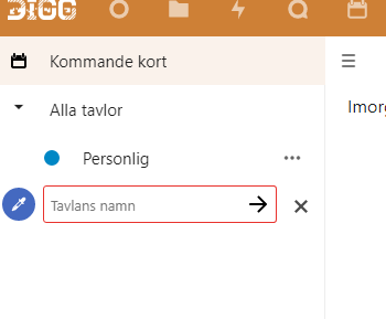
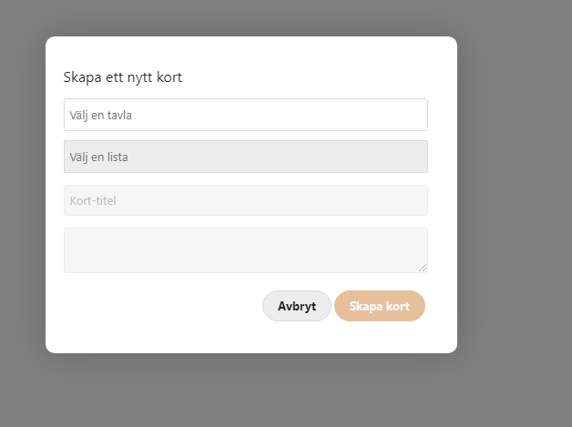
Below are two screenshots showing fields that only use placeholder-texts. Here the texts are quite dark, which is good for contrasts, but makes it look like the fields are already filled in.
Meddelande app
Another example from the app Meddelanden.

Formulär app
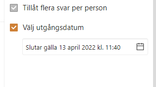
In the flyout for forms, there is a checkbox that opens a text field for entering a final date for the form. This uses a placeholder with the text “Utgångsdatum”. A label text should be used here instead.
Keep in mind that the names for the checkbox that opens the field and the field instead must be different. So the checkbox should use its visual text “Välj utgångsdatum” (“Choose a final date”), while the field instead could have “Final date” as its label text.
- Use visual labels for all input fields and other form objects
- Don’t rely on placeholder texts, use labels instead