4.1.2 Name, Role, Value
All interactive elements must have an accessible name, and a text value that explains their function to assistive technology. They should also communicate their status, so if an area can be either expanded or collapsed the button that controls the area must communicate the current state.
Several buttons are missing names or do not communicate any change of status when needed.
In some places, objects have an accessible name in English, even though the rest of the interface is in Swedish. It’s important that such visually hidden texts match the language of the rest of the interface.
We will go through some categories of different issues below, then we’ll go into problems in specific apps.
Examples of buttons controlling expandable areas
In these examples screen reader users get incorrect information about the status of the area. screen reader user needs to get information if the area is expanded or not. To solve this you can use aria-expanded on expandable objects.
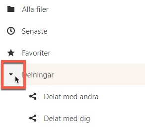
In the screenshot below the object “Delningar” opens and closes an area, this is shown with the arrow icon that is marked in the screenshot below. But it doesn’t use the aria-expanded attribute and screen reader users aren’t told of this function, or if the area is open or not.
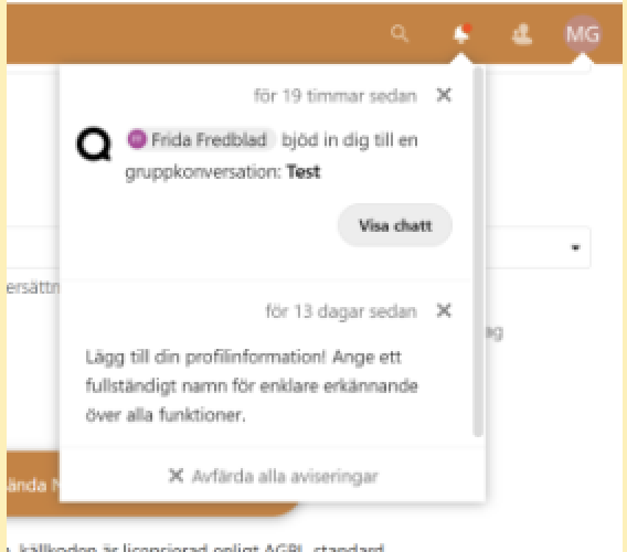
The same thing is true for the notification button shown in the screenshot below. It needs to use aria-expanded to communicate its function.
Name in the wrong language
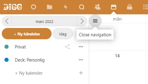
The button to open or close the side menu is named in English, but the rest of the interface is in Swedish. Make sure that the names of all objects match the language shown in the interface.
This issue is quite common and will require systematic effort to address.
Interactive objects without an accessible name or unclear name
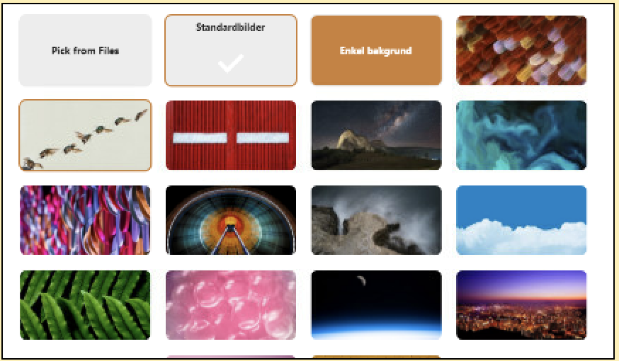
At the start settings to change background, there are interactive images that are missing accessible names. They need to have descriptions so assistive technology can communicate to the user what function they serve, and what option each image represents.
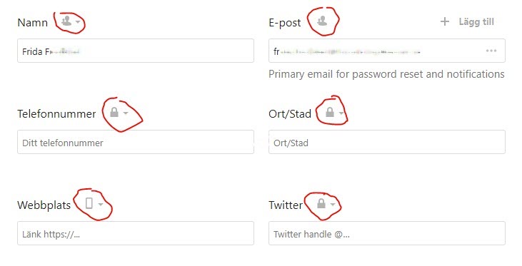
In the profile settings, the privacy level status of the different elements isn’t explained to screen reader users.
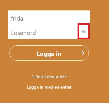
In the login form, there’s a button for showing or hiding the password. This button does not have a name and does not communicate to the user its status if the password is hidden or not. This is a security risk as a user who can’t see the interface could unknowingly expose their password to people around them.
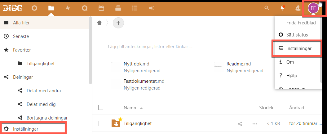
Three interactive objects are marked in the screenshot below. They all have the same accessible name, “Inställningar” (“Settings”), but they control different functions.
For example, the button with the initials in the top right and the “Inställningar”-object in the menu it opens has the same name.
This makes it hard for users relying on screen readers and similar assistive technologies to understand the difference. It would be best to include what settings it concerns in the name as well, though always begin the name with any written text on the page. So for example “Settings Files” could work.
This technically fulfils this WCAG-criterion, but in practice this is a problem.
Always make sure that an object’s accessible name identifies it and makes it easy to understand its function, and when necessary differentiates it from other, similar, objects.
Filer app
The button to add a folder as a favorite is missing an accessible name.
In the modal for copying or moving a file, there are several issues. To take just one the link for adding a folder does not have a name. In our testing, our screen reader read the link goal, which was very hard to understand.
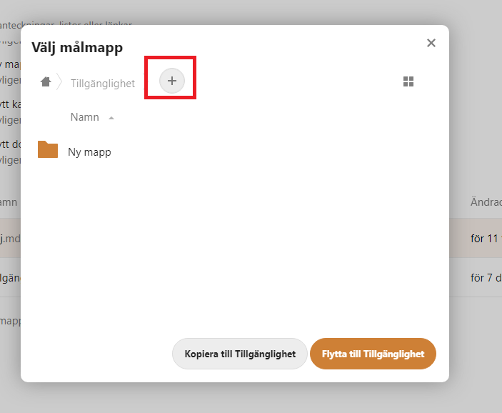
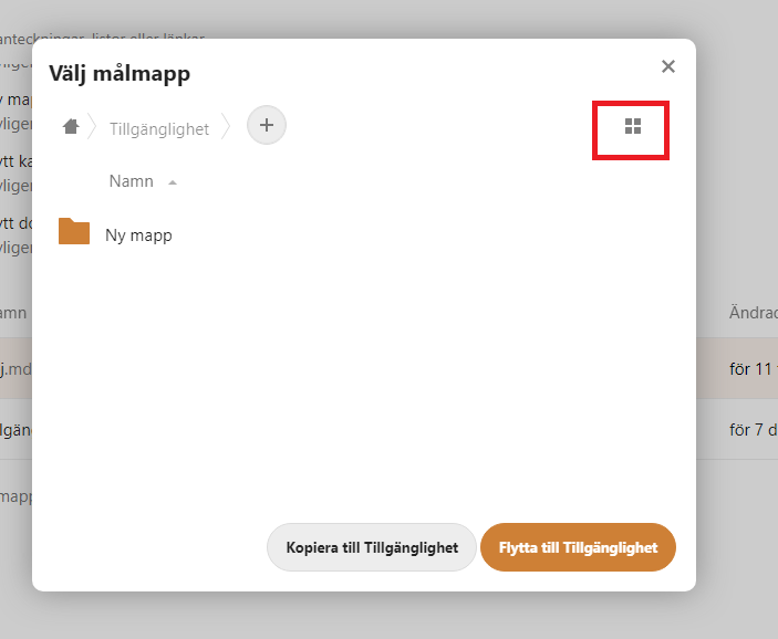
The same is true for the checkbox for activating the grid layout in the modal for copying or moving folders. This checkbox does not have an accessible name meaning that screen reader users have to guess what it does. The only information a screen reader can find is if the checkbox has is checked or not, but nothing on what that means.
The checkbox is designed to look like a button, it’s marked in the screenshot below.
The checkbox for selecting all the folders or files has the accessible name “Välj” (“Select”). This doesn’t explain that it will select all the folders or files. It’s name must be improved to more clearly explain it’s function.
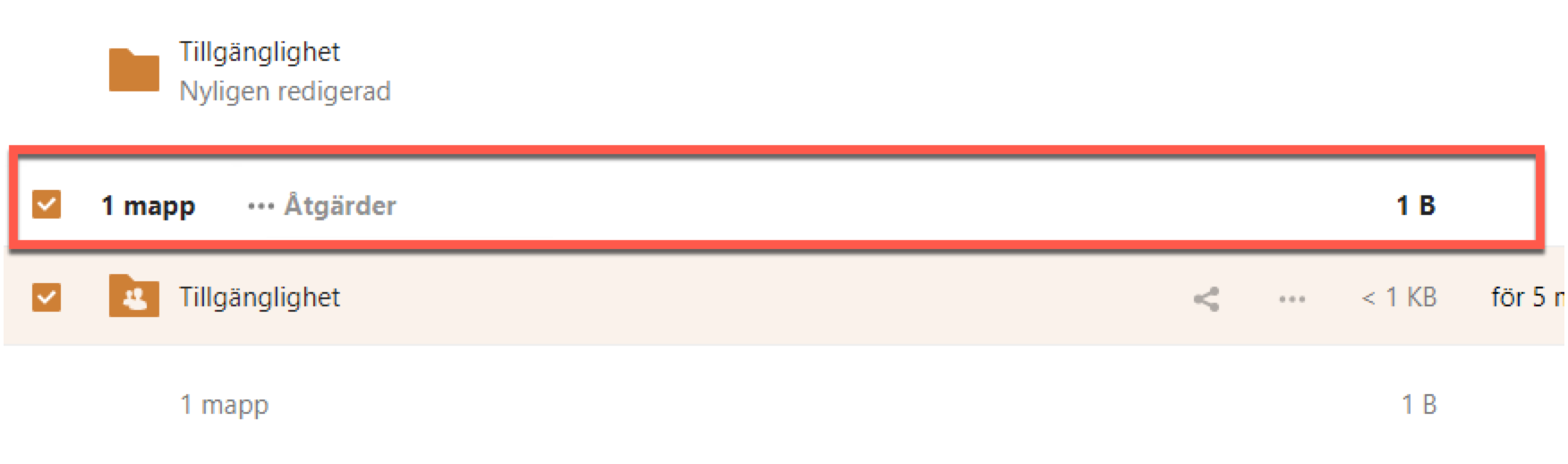
The same problem is present for checkboxes for selecting a singe document or folder in the lists.
In the screenshot below the label says “Väj” (“Select”), but it doesn’t explain which folder or document the user is selecting. Use labels to describe the function of these checkboxes more clearly.

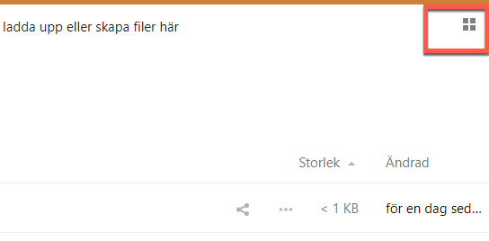
To change between a grid and a list the user activates a checkbox. Screen reader will read “Växla rutnätsvy” (“change gridview”) and whether it’s checked or not checked, but gives no information on if a grid or list is currently selected.
To make this usable for screen reader users make it clear what will happen if they activate it. “Change to grid layout”, “Change to list layout”.
This will need to be looked at and addressed with any function that changes the view in a similar way.
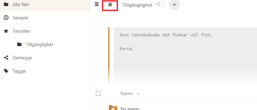
The home-button showing a house icon used to navigate back to the treeview has the English text “home”. This should be in Swedish, since the interface is in Swedish, but even if translated we believe this text can make the user believe it will lead to the start page for the whole service. Naming it something like “Hem Filer” can make it clearer that it will lead to the start page of the current app.
Talk app
There are many examples here of buttons missing names.
View and chat buttons in live conversations are missing accessible names.

The record button in chat input is missing an accessible name.

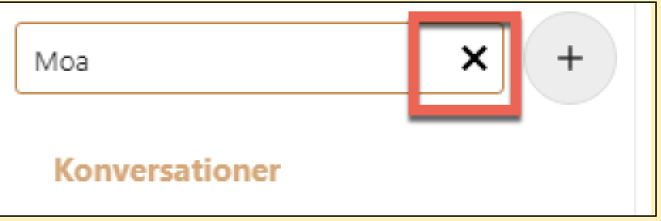
The button for removing the text from the text field is missing a name.
Kalender app
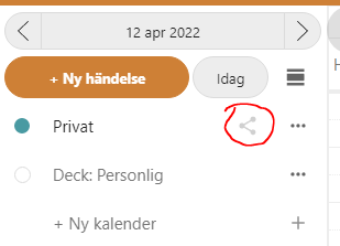
The share button marked in the screenshot below does not have an accessible name. There is an aria-label that should work as an accessible name, but it has been hidden with the aria-hidden attribute.
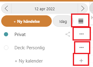
The buttons marked in the screenshot below all have different functions, but they have the same accessible name “Åtgärder”. This makes it impossible for screen reader users to know which button does what. There are generally quite a lot of issues with different elements using the same accessible name.
Since they have names this technically fulfils 4.1.2, but this really isn’t usable for screen reader users.
Make sure the names of all interactive elements clearly explain their function. Don’t use identical accessible names for objects with different functionality.
We’re also a bit perplexed why there are two buttons with tripple-dots here. Visually it’s hard to understand the difference.
In the fly-ut menu for an event, there is a button with a pen-icon. This does not have an accessible name but uses the aria-describedby attribute for the description “Redigera” (“Edit”). This attribute is great for giving additional information for an element, but it does not count towards an accessible name.
You should use actual text here, or the aria-label attribute. Visual text in combination with an icon is the most robust way to communicate a button’s function to the user.
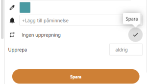
When the user activates the button it changes to a button to save the changes, and the aria-describedby changes to “Spara” (“Save”). Apart from this still not being an accessible name there is already a button named “Spara” very close by. Make sure to name this button in a way that differentiates it so it’s easy to understand exactly what it saves.
The button to change the color also doesn’t have an accessible name.
Deck app
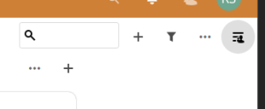
The button with the light grey marking in the screenshot below does not have an accessible name.
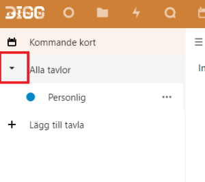
The button to expand “Alla tavlor” is missing a name. It also doesn’t use aria-expanded, so screen reader users will not be notified of its functionality.
Meddelande app
The element that opens the right side menu has the wrong role, as it is a non-semantic div-element instead of a button or link. See 2.1.1 and 4.1.3 as well.
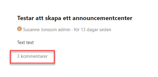
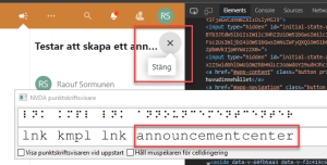
The button marked in the screenshot has got the name “announcementcenter”. This is not the most user-friendly name, but there are also issues with how it communicates that it opens and closes an area. From what we can see it uses its title-attribute to communicate that it can open or close an area. This is not very robust, some assistive technologies don’t use this attribute. Use the aria-expanded attribute to communicate its status instead.
We also recommend that you make this link into a button, set aria-hidden in the svg-element, and use a Swedish text for the name.
Formulär app
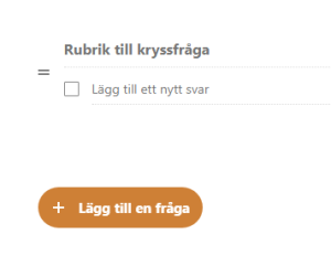
The button for adding en new question to the form has the wrong role and name. Visually there is the text “Lägg till fråga”, which would be correct. But it has been overridden by an aria-label attribute set to “åtgärder”, which is completely wrong and misleading. So screen reader users hear this erroneous description instead of the actual one.
The button is placed inside of a div-element that has been given the role of the toolbar. This is not appropriate in this situation and gives screen reader users misleading information. The button has aria-popup which informs screen reader users of its function, so remove the toolbar role from the div.
- Use aria-expanded to communicate the status for expandable objects
- Make sure all interactive elements have the correct name for their functions. And in the correct language
- Make sure all elements have their role set correctly, preferably by using correct semantic html