
1.4.11 Non-text Contrast
Graphical objects that are necessary for the user to understand the interface or the content need to have a contrast ratio to their background of at least 3:1.
This includes things such as diagrams, icons, focus markers, and similar.
Unfortunately, there are many such objects with too low contrast. This makes it harder for users with low vision to see and identify such objects, which can be a difficult obstacle in using the service.
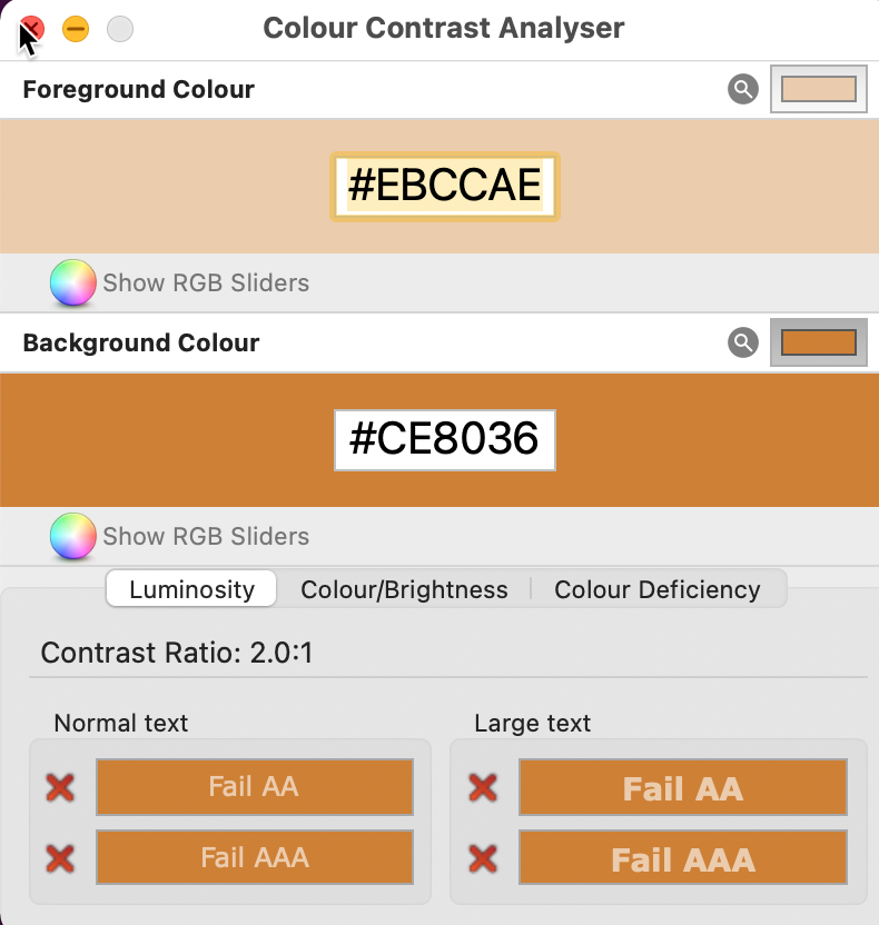
The white and orange colors used together in many places barely pass the contrast requirements here, but in some places, the white color is muted into a light orange color, and here the contrast is too low. We measure it to 2:1.
Keep in mind that the white and orange colors fail the contrast requirements for text, but you can find more information about that in 1.4.3.
We can see an example in the main menu. The active icon is white on orange, with an acceptable contrast level, but the inactive ones are more muted and fails the contrast requirement

Focus marker in login
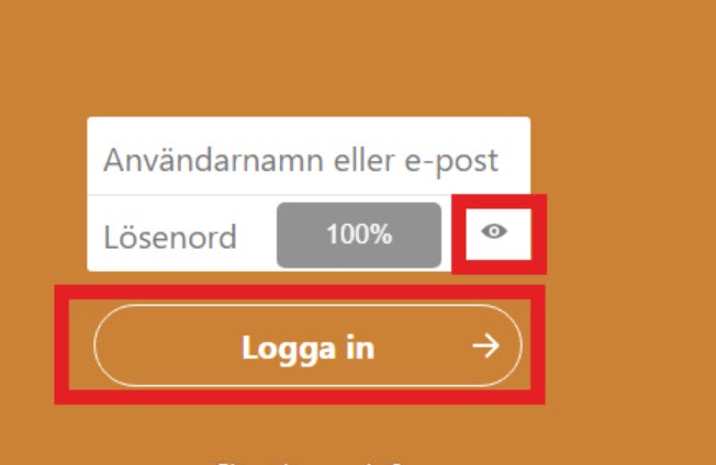
There’s an issue with the focus marker in the login where the marker in some places has too low contrast against the background, making it very hard to see.
We saw this problem for the button for hiding the password and the login button, they are marked in the screenshot below.
Talk app
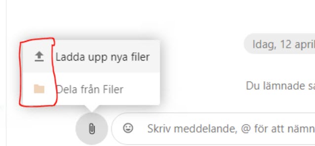
There’s a small pop-up meny for adding files to the chat, the icons there have too low contrast against the background. Since there are also texts it’s their contrast that counts for WCAG-compliance, not the contrast of the icons, but it would be better to improve the contrasts for the icons as well.
As they are now these icons look inactive, giving them better contrast will make it easier for the users to understand that they can activate these buttons.
A problem that is relevant to the WCAG-criterion is the frame around the chat field. There is text there as well, but it’s the frame that really shows the user where to enter text into the chat. And the contrast for that frame is too low against the white background.
This makes it unneccessarily difficult for users with low vision to see where to input text into the chat.
Filer app
When navigating with the keyboard a visual marking shows where focus is. But this focus marker has too low contrast against the background making it very hard to see. When text is focused it often changes shade into a lighter grey, which is very subtle and hard to see, and lowers the contrast of the text against the background.
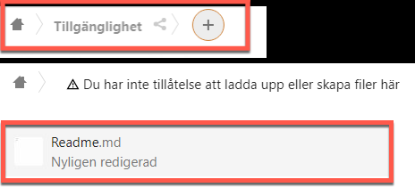
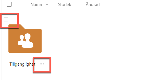
Checkboxes and grey dots in the app Files have too low contrast against the background.
Ikoner bredvid text i utfällbar meny för att bifoga filer saknar tillräckliga kontraster för grafiska objekt. Knapparna känns inaktiva då de inte har lika klar färg som mycket annat på sidan.
Aktiviteter app
The same issue with keyboard focus on interactive text objects, the text changes to a lighter shade of grey. Very hard to notice this change and the contrast against the background worsens.

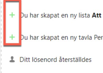
The green plus-icons have too low contrast against the background. It would generally be a good idea to look through all these icons and work to improve contrast values.
Kalender app
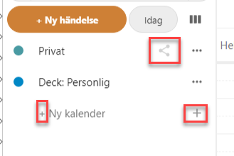
There is a several icons such as “…"-icons and plus-icons have too low contrast against the background, marked in the screenshot below.
Formulär app
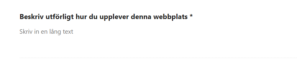
Input fields are shown with a thin, grey line with too low contrast to the white background.
Deck app
There are problems with the orange color when used on buttons, the contrast value is too low.
The focus marker is also practically non-existent when navigating in forms, making it very challenging to use them with keyboard navigation. Since even many users who mostly navigate using the mouse prefer to navigate with the keyboard in forms there would be benefits for many users to improve the focus marker here.
Make sure all information thats presented visually have a contrast ratio of at least 3:1.
This includes for example input areas, visual focus, charts, icons etc.
Make sure to have a contrast of at least 3:1 on all graphical objects that the user needs to see to use the interface. To do so:
- Make icons darker to meet the contrast requirement
- Change the design in the menu. It should stil be clear which page is active, but all icons must have good contrast
- Improve contrast for form objects, preferrably use frames instead of lines
- Improve visual focus so it’s always easy to see and has a strong contrast against the background