
1.4.3 Contrast (minimum)
We did not use the hich contrast setting to test, but based our tests on the assumption that the standard settings should pass the AA-level of contrast requirements in WCAG 2.1.
For that text must have a contrast against it’s background of at least 4.5:1. For larger text the requirement is lower at 3:1.
If text fails this requirement it will be hard for many users to discern and read it.
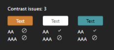
There are issues here where the colours orange and teal are used. This is a generall issue but we have some examples from different apps further down.
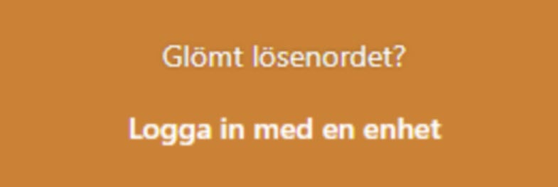
An example of white text on an orange background can be seen in the screenshot below from the login interface. We measured the contrast here to 3.1:1 which is too low for small text.
We also saw an issue on the start page where a white text was placed against ain image background giving too low contrast for parts of the text.

The users initials are occasionally shown as white text in a orange circle. The text has a contrast against its background of 2,4:1, which is too low. The example in the screenshot below is from the app Meddelanden.
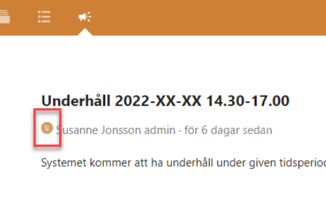
Talk app
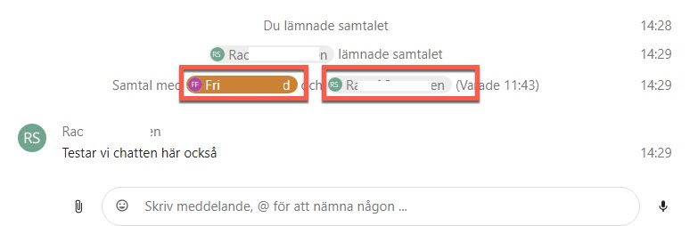
The white on orange is ok for larger text, but since it’s an issue with smaller text it might be bet to change this consistently even there. The teal text, whether against a grey or white background, has too low contrast even for larger text.
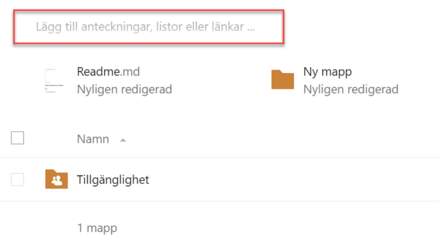
Filer app
Placeholders are light grey against a white background which fails the contrast requirements.
This isn’t unique to this app. Making contrasts better in placeholders introduces new problems, since it can make users think that the field is already filled in. It’s generally better to use labels outside the field and avoid placeholder alltogether.
Kalender app
Buttons and date fields in the calendar view use white on orange, which fails the contrast requirements.
Formulär app
Orange texts used here as well, in the example below we measured the contrast against the background to 2.3:1.

Change the contrasts for texts with the orange and teal colours, either by changing the texts or their backgrounds.
Contrast between text and it’s background should have a ratio of:
- 4.5:1 - Small text
- 3:1 - Text larger then 18pt
Avoid using text against an image background to avoid contrast issues.