
2.4.7 Focus Visible
When navigating with the keyboard a visual marker shows where focus is. This marker must be easy to see and follow to make keyboard navigation as easy as possible.
Unfortunately, there are several interactive objects that are missing visual focus. In combination with issues with the focus order and poor contrasts, this makes it hard to navigate with the keyboard.
Focus must be shown on all interactive objects, and it must have a contrast of at least 3:1 ratio (See 1.4.11).
This is a consistent problem in the whole service that needs to be looked at as a whole.
Here are some examples of interactive objects that are missing visual focus:
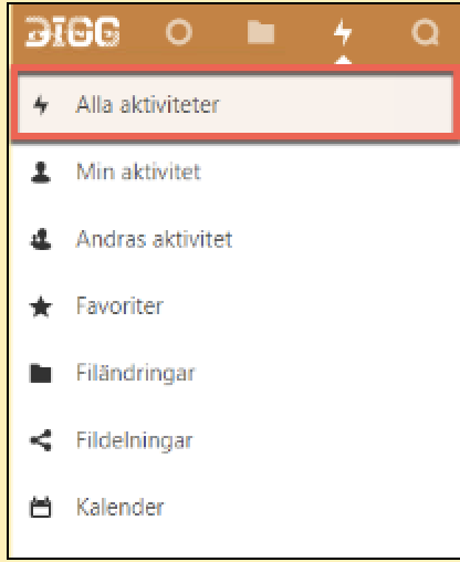
The active link in the side menu has no focus marker. So in the screenshot below we are on the “Alla aktiviteter”-page, that link is marked as currently active in the menu, but when we tabb to it there is nor marker showing focus.
It’s great that you mark the active link in the menu, but it needs to have a focus marker if it’s possible to tab to it.
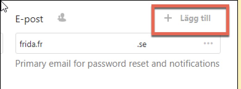
This screenshot is from the profile setting page. The “Lägg till” button below is missing visual focus.
The button for opening the side menu has different focus markings in different parts of the service. All of them use a hamburger icon and three parallel horizontal lines. Some examples of these focus markers are a light blue background or a light grey background with an orange frame. But most commonly they don’t have any focus marker at all.
To conform to the WCAG-standard these need to have a visible focus marker, but beyond that it’s also important that the focus marker is consistent. Consistency makes it easier for all users, but it’s especially important for some user groups.
Example from login
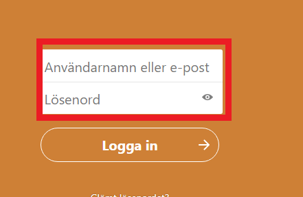
The text fields in the login do not have a focus marker. In the screenshot below we have marked them with a frame.
Kalender app
No focus marker is shown in the side menu, making it unusable for keyboard users.
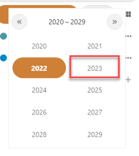
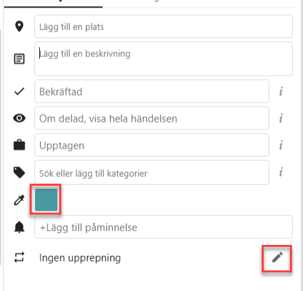
There are many objects without a focus marker in the fly-out. In the sceenshot below focus is on “Beskrivning” but only the text marker indicates that which is not enough for a text field.
The same issue is there for the modal window that opens in wider viewports.
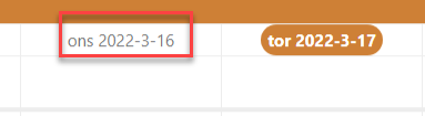
There is no focus marker in the month and week views. Even when the tooltip for dates is shown after a delay it’s not enough.
- Make sure that all interactive objects have a visual focus
- Make sure that visual focus is consistently designed
- Make sure that the focus has a contrast ratio of at least 3:1